Følgende nettside har en veldig fin demo med utdypende og flott forklaring/avklaring:
https://www.w3schools.com/cssref/trysel.asp?selector=id
Følgende nettside lister opp ALLE valgene: https://www.w3schools.com/cssref/css_selectors.asp
Følgende nettside viser med konkret fremhevelse hva de forskjellige valgene utfører og peker på: https://www.w3schools.com/cssref/trysel.asp
Følgende side er på norsk: http://xn--hkon-qoa.org/wp/avanserte-css-selektorer/ og http://xn--hkon-qoa.org/wp/html5-void-elements/
Følgende side med gode eksempler: https://www.geeksforgeeks.org/css-selectors-complete-reference/?ref=rp
Generelle regler
Du kan ikke bruke mellomrom på id-navn og class-navn og heller ingen spesialtegn som / % ´ og lignende.
Du kan bruke tall men navnet kan ikke begynne med et tall. 01header går ikke men header01 går.
Bindestrek (-) og understrek (_) går fint.
NB! You can't use inline elements for styling pseudo classes.
FRA http://håkon.org/wp/avanserte-css-selektorer/
Selektorer kan kombineres på ulike måter. For å forklare disse bør man først vite hva som menes
med foreldre (parents), søsken (siblings) og barn (children) når det kommer til HTML-elementer.
Foreldre er elementer som har andre elementer inne i seg, søsken er elementer som ligger på samme
hierarkiske plassering i en forelder, og barn er elementer inne i en forelder.
Det skilles også mellom etterkommer (descendant) og barn (child): en etterkommer er et element
som er nestet i et annet element, uansett hvor langt ned i et eventuelt hierarki,
mens et barn bare er nestet i sitt forelder-element, og ikke f.eks. i et nytt element inne i
et forelder-element. Som en sammenligning er en datter barn av sin mor,
mens datterens barn ikke er barn av sin bestemor, men derimot en etterkommer.
Eksempel:
<div>
  <h2>Overskrift</h2>
  <p>Brødtekst med <a href="#">lenke</a>.</p>
</div>
I eksemplet over er div-elementet og p-elementet foreldre, fordi de har andre elementer
inne i seg. h2-elementet og p-elementet er søsken av hverandre, samt barn av div. Og a-elementet
er barn av p-elementet og etterkommer av både div- og p-elementet.
FØLGENDE KAN BEARBEIDES KLIPPES OPP I BITER DER DE HØRER HJEMME
Pseudo-klasser
Pseudo-klasser er “nøkkelord” som velger elementers karakteristikk basert på informasjon utenfor dokument-treet eller informasjon som ikke vanlige selektorer dekker. Det kan f.eks. være elementer i en spesiell tilstand (state), elementer i en viss strukturell plassering, eller andre ting. Ettersom pseudo-klassene ikke vises i dokument-treet, kan ikke pseudo-klasser settes inline på et element.
Merk at enkelte pseudo-klasser er gjensidig ekslusive, dvs. at et element bare kan ha én av flere visse pseudo-klasser angitt samtidig. Et eksempel er pseudo-klassene :link og :visited; et element kan bare ha en av dem til enhver tid – aldri begge samtidig.
Syntaks
:pseudo-class { }
Den generelle syntaksen for pseudo-klassser er et kolon etterfulgt av navnet på pseudo-klassen (og eventuelt en verdi mellom to paranteser).
Pseudo-klasser kan være generelle og gjelde for alle elmenter med en gitt pseudo-klasse: man kan f.eks. f.eks. skrive kun :focus for å stilsette alle elementers focus. Eller de kan knyttes til en annen selektor, f.eks. input:focus, som stilsetter alle input-elementer i tilstanden focus.
Ulike typer pseudo-klasser
Pseudo-klassene kan deles inn i ulike kategorier, etter måten de fungerer på.
Dynamiske pseudo-klasser
Dynamiske pseudo-klasser velger elementers karakteristikk basert på informasjon utenfor dokument-treet. De dynamiske klassene kan igjen deles inn i følgende kategorier.
Linker
Pseudo-klassene :link og :visited gjelder for linker som er hhv. ikke besøkt og besøkt.
a:link – stilsetter alle a-tagger med href-attribut (a-tagger med såkalte fragment-identifiserere [href=”#id”] dekkes likevel ikke av denne selektoren). a:visited – stilsetter alle a-tagger som er besøkt
User Action states
Tilstander som endres etter brukerinteraksjon med elementene.
a:active – når aktivert (fra mousedown til mouseup) a:focus – når nettleseren har fokus på elementet (ved tab eller f.eks. plassere markøren i et skjemafelt) a:hover – hover
UI-elementers states
Visse brukerinteraksjonselementer kan ha ulike tilstander og velges med egne pseudo-klasser. Dette kan være elementer som tekstfelt, radioknapper, checkbox osv. Støttes i de fleste nettlesere, inkl. IE9.
input:enabled – et element som er enabled kan bli aktivt og få fokus. Alle skjemaelementer er aktive som default input:disabled – velger elementer som er disabled. Disse kan ikke velges, akseptere input etc. (disabled kan settes inline i HTML med boolean disabled [eks: <input type=”text” disabled>]) input:checked – velger elementer (radio, checkbox eller option) som er valgt / krysset av.
Target
:target er en egen pseudo-klasse som velger elementer som er den gjeldende fragment-identifisererern i URL-en.
Er man f.eks. inne på URL-en http://eksempel.no/#id1 vil elementet med id “id1” bli stilsatt av :target. Er man derimot på samme side, men på URL-en http://eksempel.no/ vil ingen elementer være stilsatt av :target.
Negasjon
:not() velger elementer som ikke er det du angir. Det kan f.eks. være en elementtype, en id eller klasse, eller en selektor.
Eksempel:
div:not( [class=”klasse1″] ) {} velger alle div-elementer, unntatt de med klasse “klasse1”.
Strukturelle pseudo-klasser
Strukturelle pseudo-klasser angir elementer basert på den strukturelle plasseringen i HTML-dokumentet.
Root
:root – velger elementet som er roten i dokumentet, som i de fleste tilfeller (og alltid i HTML4) er html-elementet.
Empty
:empty – velger elementer som hverken har innhold eller andre elementer inne i seg. Denne selektoren kan bl.a. være nyttig for å stilsette dynamisk innhold som resulterer i at et element ikke får noe innhold.
First-, last- og only-child
ul:first-child – velger første element inne i en <ul>, f.eks. det førstse <li>-elementet.
ul:last-child – som over, men det siste elementet
:only-child – velger elementer som er eneste child-element (ingen siblings/søsken, dvs. elementer på samme nivå med samme forelder)
nth-child
Velger elementer som er en viss child ift. sin parent. Merk at det er child/barn-elementet man velger og ikke parent/forelder-elementet.
Syntaks:
element:nth-child(argument) {}
argumenter kan være: odd (oddetall); even (partall); nummer, f.eks. 3; expression: an+b, hvor b er det første elementet man skal starte på og a er frekvensen, f.eks. 2n+5 som vil velge 5, 7, 9 osv;
Eksempler:
li:nth-child(odd) {} velger alle li-elementer som er oddetallsnummer i rekkefølge ift. sin parent: den første, tredje, femte osv.
li:nth-child(even) {} samme som over, men partall.
li:nth-child(3) {} alle li-elementer som er child nr. 3 av sin parent
Forenklinger av argumenter: hvis a er 1, f.eks. 1n+3, kan man sløyfe a, ettersom det blir det samme som n+3. Hvis b er 0, eller a og b er like, kan b sløyfes: 2n+0 og 2n+2 kan skrives 2n ettersom de gjør det samme.
Man kan også bruke negative verdier. Hvis man f.eks. vil velge de 5 første children, kan man skrive -n+5 (som er en forkortelse av -1n+5).
nth-last-child
fungerer som nth-child, men teller fra siste child.
Eksempel:
-n+3 velger de tre siste.
nth-of-type
som nth-child, men velger en viss type element.
Eksempel:
div:nth-of-type(3) {} velger alle div-elementer som er child nr. 3 av en parent
På samme måte som nth-last-child finnes også nth-last-of-type() som teller fra siste child.
nth-only-of-type
Det finnes også nth-only-of-type som velger elementer av en viss type som er eneste child av sin parent. F.eks. p:nth-only-of-type{} velger alle p-elementer som er eneste child av sin parent.
Pseudo-elementer
Man skiller mellom pseudo-klasser og pseudo-elementer. Der pseudo-klasser velger elementer som har en viss tilstand eller egenskap, velger pseudo-elementer deler av et dokument som ikke nødvendigvis eksisterer som elementer eller som ikke kan velges med vanlige selektorer.
Syntaks
For å skille pseudo-elementer fra pseudo-klasser, bruker man f.o.m. CSS3 to kolon i stedet for ett (i CSS1/2 ble de skrevet med ett). Eksempel:
p::first-letter – velger første bokstav i alle p-elementer
IE7 og IE8 støtter pseudo-elementer i CSS1/2-syntaks, dvs. når det er skrevet med ett kolon – men ikke når det er skrevet med to (CSS3). Andre nettlesere støtter imidlertid pseudo-elementer skrevet med bare ett kolon, så hvis støtte for IE7/8 er viktig, kan du skrive pseudo-elementene med bare ett kolon. Merk imidlertid at W3-spec’en sier at bakoverkompatibel-støtte for CSS1/2-syntaks – ett kolon – kun er lov på pseudo-elementer som allerede fantes i CSS2. Så nye pseudo-elementer som ble introdusert i CSS3 skal alltid skrives med to kolon. I spec’en ser det likevel ikke ut til at noen nye pseudo-elementer ble innført i CSS3, så det ser ut til å være et grunnløst forbehold. Men alt i alt er hovedregelen at du bør bruke to kolon om du ikke har en god grunn til noe annet.
Det er bare tillatt å bruke ett pseudo-element pr. selektor, men det kan fint kombineres med pseudo-klasser. Eksempel: p:first-child::first-letter {}
First-line / First-letter
p::first-letter – velger første bokstav av alle p-elementer. Fint for å lage “drop caps” p::first-line – velger første linje av alle p-elementer
Before/after
Med pseudo-elementene ::before og ::after kan man sette inn virtuelle elementer foran eller etter et elements innhold – dette kalles generert innhold. Disse pseudo-elementene kan ha eget innhold, blir synlige for brukeren som egne elementer og kan også styles som sådan. Men de finnes ikke i kildekoden.
#element::before – setter inn innhold før #element::after – setter inn innhold etter
Ettersom det er generert innhold man lager, må man angi innhold i pseudo-elementet. Derfor må man ha med en deklarasjon for content, som inneholder tekst som skal settes inn. Vil du ikke ha noe tekstinnhold, men bare f.eks. et bilde etc. kan verdien være tom (content: “”;), men content må deklareres med tomt innhold uansett for at det skal fungere.
For best kompatibilitet med eldre IE bør man (i tillegg til å bruke CSS1/2-syntaks med ett kolon) bruke et mellomrom i stedet for å la content-verdien stå helt tom: content: ” “;
(mellomrommet vil ikke vises, så det vil bli som å skrive ingenting mellom anførselstegnene).
Eksempel:
#element::after {
  content: "Dette vises i pseudo-elementet";
  color: #666;
}
En annen ting som er greit å vite om er at content-egenskapen kan bruke enkle funksjoner for å generere innhold fra elementets attributer.
Eksempel:
a#file::after {
  content: attr(href);
}
Dette vil da hente href-verdien til a-elmenetet og vise i pseudo-elementet ::after.
Selv om pseudo-elementene heter ::before og ::after, settes det genererte innholdet inn før og etter innholdet i elementet – ikke før og etter selve elementet – men som child-elementer i elementets box model. Det betyr at hvis hovedelementet har en border, vil ::before/::after-elementer havne innenfor kantlinja. Men i og med at man kan style pseudo-elementene som man vil, kan man f.eks. bruke absoulute position og plassere de visuelt utenfor hovedelementet.
Use class when you want your styling to apply to a group of elements.
Alternatively, use id to find a needle in a haystack, and style only that specific element.
.classnavn {...}
En CSS .classnavn kan gjenbrukes og styre flere forskjellige elementer på en og samme side:
<h3 class="classnavn">Header tekst</h3>
<p class="classnavn">Header tekst</p>
The CSS class Selector
The class selector selects HTML elements with a specific class attribute.
To select elements with a specific class, write a period (.) character, followed by the class name.
Classes of the same name can be given to any number of elements on a page and they will all receive the styling
associated with that class. This will always be true unless you specify the element within the CSS.
.center {
  text-align: center;
  color: red;
}
<h1 class="center">Red and center-aligned heading</h1>
<p class="center">Red and center-aligned paragraph.</p>
Red and center-aligned heading
Red and center-aligned paragraph.
Bruke flere forskjellige på ett element
You can apply more than one class selectors to given element. Consider the following example:
<p class="bold center italic">
This paragraph will be styled by the classes bold and center and italic.
</p>
This paragraph will be styled by the classes bold and center and italic.
Rekkefølgen på multi-bruk
Viktig å bygge opp CSS i riktig rekkefølge, da den siste (nederste) generelt sett har prioritet.
Rekkefølgen på .class1 { } og .class2 { } har innvirkning på HTML.
Rekkefølgen på class1 og class2 i HTML har ingen innvirkning.
Fra developer.mozilla.org
The CSS class selector matches elements based on the contents of their class attribute.
/* All elements with class="spacious" */
.spacious {
  margin: 2em;
}

/* All <li> elements with class="spacious" */
li.spacious {
  margin: 2em;
}

/* All <li> elements with a class list that includes both "spacious" and "elegant" */
/* For example, class="elegant retro spacious" */
li.spacious.elegant {
  margin: 2em;
}
Syntax
.class_name { style properties }
Note that this is equivalent to the following attribute selector:
<p class="red">This paragraph has red text.</p>
<p class="red yellow-bg">This paragraph has red text and a yellow background.</p>
<p class="red fancy">This paragraph has red text and "fancy" styling.</p>
<p>This is just a regular paragraph.</p>
This paragraph has red text. (class="red")
This paragraph has red text and a yellow background. (class="red yellow-bg")
This paragraph has red text
and "fancy" styling. (class="red fancy")
This is just a regular paragraph.
Gjøre om standard ELEMENT til et CLASS
Fra standard H
<h3>Heading</h3>
Til "egen" H, CSS og CLASS:
h3.egen {}
<h3 class="egen">Heading</h3>
God forklaring, dog på CSS2 men fortsatt gjeldende
FRA (http://css.maxdesign.com.au/selectutorial/selectors_class.htm)
Less class
Class selectors can also be overused. For example, you may need to style a range of
elements within a <div>. All elements within the <div> could be styled
using one class applied to the <div>. You should try to avoid unnecessary
markup like this:
With one class in place, you can target any element inside the <div>.
The examples below use a combination of class selectors and type selectors.
When added together they become descendant selectors
(PB: ELEMENT ELEMENT).
div.sidenav { blah } /* styles overall div */

div.sidenav h2 { blah } /* styles h2 within the div */

div.sidenav ul { blah } /* styles ul within the div */

div.sidenav li { blah }  /* styles li within the div */

div.sidenav li a { blah } /* styles a within li within the div */
***
PB: Info
En .center og en p.center kan begge benyttes, eksempelvis i en liste.
Mens .CLASS vil gjelde for det den er satt på,
vil eksempelvis P.CLASS kun gjelde for alle P i listen som er stilsatt med P.CLASS.
Du kan ikke bruke mellomrom på id-navn og class-navn og heller ingen spesialtegn som / % ´og lignende.
Du kan bruke tall men navnet kan ikke begynne med et tall. 01header går ikke men header01 går.
Bindestrek og understrek går fint.
.CLASS1.CLASS2
Selector
Example
Example description
.class1.class2
.name1.name2
Selects all elements with both name1 and name2 set
within its class attribute
.CLASS1.CLASS2 = An element with classes CLASS1 and CLASS2.
Eksempel med borders styrt av CLASS som er satt inntil hverandre.
Target an element if it has more than one class applied
You can apply multiple classes to an element and target them individually,
or only select the element when all of the classes in the selector are present.
This can be helpful when building up components that can be combined in different ways on your site.
In the example below, we have a <div> that contains a note.
The grey border is applied when the box has a class of notebox.
If it also has a class of warning or danger,
we change the border-color.
We can tell the browser that we only want to match the element if it has two classes
applied by chaining them together with no white space between them.
You'll see that the last <div> doesn't get any styling applied,
as it only has the danger class; it needs notebox as well to get anything applied.
<div class="notebox">
    This is an informational note.
</div>

<div class="notebox warning">
    This note shows a warning.
</div>

<div class="notebox danger">
    This note shows danger!
</div>

<div class="danger">
    This won't get styled — it also needs to have the notebox class
</div>
This is an informational note. (har kun notebox)
This note shows a warning. (kombinerer notebox warning)
This note shows danger! (kombinerer notebox danger)
This won't get styled — it also needs to have the notebox class (har kun danger)
.CLASS1 .CLASS2
Selector
Example
Example description
.class1 .class2
.name1 .name2
Selects all elements with name2 that is a descendant of an
element with name1
.CLASS1 .CLASS2 = An element with class CLASS2 somewhere within an element with class CLASS1.
Eksempel med buttons styrt av CLASS som er adskilte med mellomrom.
Overriding occurs because of the order of .call-to-action and
.button in our stylesheet. When there’s two conflicting
properties in a CSS file, the last one is always the one that gets applied. So,
if you moved .call-to-action to the top of
styles.css, .button would have the final word on the
value of background-color, and it would remain blue.
This means that the order of the class attribute in our HTML
element has no effect on override behavior. Multiple classes on a single
element are applied “equally” (for lack of a better term), so the
precedence is determined solely by the order of the rules in
styles.css. In other words, the following elements are effectively
equivalent:
Dette blir som ved bruk av lister for å opprette menyer, eksempelvis fra (https://oppgaver.kidsakoder.no/web/layout/layout):
nav ul li{
    float:left;             /* gjør at teksten flyter fra venstre mot høyre */
    list-style-type: none;  /* gjerner punktet foran liste-elementet */
}
Grunnen til at vi skriver nav ul li på denne er for å spesifisere at vi skal sette
stil på li (List items) i den uordnede listen ul som ligger innenfor nav-taggen.
På denne måten vil ikke andre lister bli påvirket av den stilen vi setter,
kun den lista som ligger mellom <nav>-taggen.
.CLASS1, .CLASS2
Selector
Example
Example description
.class1, .class2
.name1, .name2
Selects all name1 elements and all name2 elements
.CLASS1, .CLASS2 = 1. An element with class CLASS1. 2. An element with class CLASS2.
Tabellen over er lagt til av meg, og sammenfattet fra div, p.
Eksempel styrt av 2 x CLASS, adskilte med kommategn, er en måte å samle elementer som kan stå isolert hver for seg.
De deler felles egenskaper, og kan settes opp hver for seg i tillegg med egenskaper som skiller dem.
Ved å samle separate CSS selektorer unngår en å lage store CSS-filer, får det mer oversiktlig
Using Commas to Separate Selectors
Instead of writing 4 separate CSS selectors and 4 rules, you can combine all these styles into one rule property
by separating the individual selectors with a comma. Here is how that would be done:
With this syntax, you are saying that you want th tags, td tags, paragraph tags with the class red,
and the div tag with the ID firstred all to have the style color red.
You can define style rules based on the id attribute of the elements.
All the elements having that id will be formatted according to the defined rule.
#black {
  color: #000000;
}
This rule renders the content in black for every element with id attribute set to black in our document.
You can make it a bit more particular. For example:
h1#black {
   color: #000000;
}
This rule renders the content in black for only <h1> elements with id attribute set to black.
The true power of id selectors is when they are used as the foundation for descendant selectors, For example:
#black h2 {
   color: #000000;
}
In this example, all level 2 headings will be displayed in black color when those headings will lie within tags having id attribute set to black.
The CSS id Selector
The id selector uses the id attribute of an HTML element to select a specific element.
The id of an element is unique within a page, so the id selector is used to select one unique element!
To select an element with a specific id, write a hash (#) character, followed by the id of the element.
#para1 {
  text-align: center;
  color: red;
}
<p id="para1">Hello World!</p>
<p>This paragraph is not affected by the style.</p>
Hello World!
This paragraph is not affected by the style.
ID Selectors
An ID selector begins with a # rather than a dot character, but is used in the same way as a class selector.
However, an ID can be used only once per page, and elements can only have a single id value applied to them.
It can select an element that has the id set on it,
and you can precede the ID with a type selector to only target the element if both the element and ID match.
You can see both of these uses in the following example:
Warning: Using the same ID multiple times in a document may appear to work for styling purposes,
but don't do this. It results in invalid code, and will cause strange behavior in many places.
Note: As we learned in the lesson on specificity, an ID has high specificity.
It will overrule most other selectors. In most cases, it is preferable to add a class to an element instead of an ID.
However, if using the ID is the only way to target the element — perhaps because you do not have access to the markup
and cannot edit it — this will work.
***
Advarsler
code.tutsplus.com
Prefixing the hash symbol to a selector allows us to target by id.
This is easily the most common usage; however, be cautious when using id selectors.
Ask yourself: do I absolutely need to apply an id to this element in order to target it?
id selectors are rigid and don't allow for reuse.
If possible, first try to use a tag name, one of the new HTML5 elements, or even a pseudo-class.
Du kan ikke bruke mellomrom på id-navn og class-navn og heller ingen spesialtegn som / % ´og lignende.
Du kan bruke tall men navnet kan ikke begynne med et tall. 01header går ikke men header01 går.
Bindestrek og understrek går fint.
The universal selector (*) selects all HTML elements on the page.
The CSS rule below will affect every HTML element on the page:
* {
  text-align: center;
  color: blue;
}
****
The universal selector.
* matches any element in the page. Used as a whole, not to replace a part of string.
*****
Rather than selecting elements of a specific type, the universal selector simply matches the name of any element type.
*****
The universal selector **
The symbol * represents any element: all classes, id, or markers.
The rule:
* { color:blue; }
applies to <p>, <h1> and all other tags, and any named element.
** ** ** **
An asterisk
At appropriate places, an asterisk may be used as a wildcard to select every element.
* { } (all elements)
.parent * { } (all descendants)
.parent > * { } (all children)
*** *** ** ** *** ***
VIKTIGE ADVARSLER
code.tutsplus.com
The star symbol
* {
 margin: 0;
 padding: 0;
}
The star symbol will target every single element on the page.
Many developers will use this trick to zero out the margins and padding.
While this is certainly fine for quick tests, I'd advise you never to use this in production code.
It adds too much weight on the browser, and is unnecessary.
<ul>
  <li>En (ordinær) liste</li>
  <li>Som nå ikke får noen</li>
  <li>Margin og Padding</li>
</ul>
This will target every single element that is a child of the #containerdiv.
Again, try not to use this technique very much, if ever.
Dette påvirker ikke dennes DIV, men absolutt alt av dennes innhold. Andre elementer utenfor blir heller ikke påvirket.
<div id="container">
<h3>Overskrift H3</h3>
<p>Tekst i en P med en <span>SPAN</span> midt i innholdet.</p>
<ul>
  <li>En (ordinær) liste</li>
  <li>Som nå får</li>
  <li>Borders</li>
</ul>
</div>
ELEMENT.CLASS = An <element> element with class CLASS.
E.C
Informasjon om E.C:
Gruppe: Enkle selektorer.
Styrer: Alle elementer E med klasse C.
Class Selectors in CSS
Fra (tutorialspoint.com)
You can define style rules based on the class attribute of the elements.
All the elements having that class will be formatted according to the defined rule:
.black {
   color: #808000;
}
This rule renders the content in black for every element with class attribute set to black in our document.
You can make it a bit more particular. For example:
h1.black {
   color: #808000;
}
This rule renders the content in black for only <h1> elements with class attribute set to black.
You can apply more than one class selectors to given element. Consider the following example:
<p class = "center bold">
   This para will be styled by the classes center and bold.
</p>
This para will be styled by the classes center and bold.
Targeting classes on particular elements
Fra (developer.mozilla.org)
You can create a selector that will target specific elements with the class applied. In this next example,
we will highlight a <span> with a class of highlight differently
to an <h1> heading with a class of highlight.
We do this by using the type selector for the element we want to target,
with the class appended using a dot, with no white space in between.
<h1 class="center">This heading will not be affected</h1>
<p class="center">This paragraph will be red and center-aligned.</p>
<p class="center large">This paragraph will be red, center-aligned, and in a large font-size.</p>
This heading will not be affected
This paragraph will be red and center-aligned.
This paragraph will be red, center-aligned, and in a large font-size.
Blanding av id og element.class
Alle li som befinner seg i angitt id blir påvirket.
I tillegg vil li.favorite kunne skille ut angitt li.
This defined style rule will be applicable to h1, h2 and h3 element as well. The order of the list is irrelevant.
All the elements in the selector will have the corresponding declarations applied to them.
Heading
Heading
Heading
You can combine the various id selectors together as shown below:
Denne hadde som eksempel: { position: absolute; left: 510px; width: 200px; },
og dette la alt innholdet opp på hverandre. Egentlig helt meningsløst, så jeg laget derfor eget innhold:
The CSS grouping selector is used to select multiple elements and style them together.
This reduces the code and extra effort to declare common styles for each element.
To group selectors, each selector is separated by a space.
ELEMENT ELEMENT = An <element> element somewhere within an <element> element.
(E F) Any F element that is a descendant of an E element (that is: a child, or a child of a child, etc.)
Descendant Selector
Fra (håkon.org/wp/avanserte-css-selektorer/)
1. Descendant (etterkommer)-kombinator
Angis med mellomrom og velger elementer i andre selektor som er etterkommere av elementet/elementene i første selektor.
Eksempel:
div p {

}
Velger alle p-elementer som er inne i en div, samme hvor langt nede i hierarkiet de befinner seg.
Nesting
Fra (www.htmldog.com/guides/css/intermediate/grouping/)
If the CSS is structured well, there shouldn’t be a need to use many class or ID selectors.
This is because you can specify properties to selectors within other selectors.
This removes the need for classes or IDs on the p and h1 tags if it
is applied to HTML that looks something like this:
<h1>Chocolate curry</h1>
<p>This is my recipe for making curry purely with chocolate</p>
<p>Mmm mm mmmmm</p>
This is because, by separating selectors with spaces,
we are saying “h1 inside ID top is colour #ff0”
and “p inside ID top is red and bold”.
Fra css.maxdesign.com.au
FRA (http://css.maxdesign.com.au/selectutorial/selectors_descendant.htm)
Gode forklaringer, dog på CSS2, men fortsatt gjeldende. Nettsiden har mange gode og billedliggjorte forklaringer.
Plukket ut og utvidet med et eksempel.
em { font-weight: bold; }

ul em { color: blue; }
ELEMENT ELEMENT
<p>Denne teksten er <em>før og utenfor</em> UL-listen.</p>
<ul>
<li>Vanlig liste-tekst</li>
<li>Vanlig liste-tekst</li>
<li>Liste-tekst <em>med EM</em> innenfor.</li>
</ul>
<p>Denne teksten er <em>etter og utenfor</em> UL-listen.</p>
Fra css-tricks.com
A descendant selector in CSS is any selector with white space between two selectors without a combinator.
Here’s some examples:
ul li {  }
header h2  {  }
footer a  {  }
.module div {  }
#info-toggle span  {  }
div dl dt a  {  }
Take ul li { } for example.
It means “any list item that is a descendant of an unordered list.”
Descendant means anywhere nested within it in the DOM tree. Could be a direct child, could be five levels deep,
it is still a descendant.
This is different than a child combinator (>)
which requires the element to be the next nested level down.
To illustrate, div span { } will match:
ELEMENT ELEMENT
<div>
<span>I will match</span>
<ul>
<li>
<span>I will match too</span>
</li>
</ul>
</div>
You probably shouldn’t worry about it very much, but the decedent selector is
pretty “expensive” – meaning hard/slow for rendering engines to figure
out and do stuff with. MDN:
The descendant selector is the most expensive selector in CSS.
It is dreadfully expensive—especially if the selector is in the Tag or Universal Category.
But only in comparison to other selectors. It’s still blazingly fast
and you’ll probably never notice it unless you go crazy.
Descendant Selectors
Fra tutorialspoint.com
The descendant selector in CSS is used to match all elements that are descendants of a specified element. Altså kun etterkommere påvirkes,
div p {
  background-color: orange;
}
ELEMENT ELEMENT
<p>P tekst 1, før DIV.</p>
<div>
<p>P tekst 2, i DIV.</p>
<p>P tekst 3, i DIV.</p>
</div>
<p>P tekst 4, etter DIV.</p>
Descendent Selectors in CSS
Suppose you want to apply a style rule to a particular element only when it lies inside a particular element.
As given in the following example, style rule will apply to <em> element only when it lies inside <ul> tag.
ul em {
   color: #FFFF00;
}
Suppose now for <ol> element and style rule applied to <strong>:
ol strong {
   color: #808000;
}
The CSS element selector is used to select the descendant of first element with element name matching the second selector.
Syntax
The syntax for CSS descendant selector is as follows -
element element {
  /*declarations*/
}
Example
div {
   float: right;
   margin: 25px;
   padding: 5px;
   width: 80px;
   height: 80px;
   border: solid aqua;
}
div div {
   border-color: blue;
   border-radius: 50%;
}
div div div {
   border-color: orange;
   border-radius: unset;
}
<div>
<div>
<div>
</div>
</div>
</div>
Denne var ikke lett å kopierer som inline CSS, derfor ligger dette kun som et bilde.
Fake resultat
Example
li li {
   background-color: lightsteelblue;
}
ELEMENT ELEMENT
<ol>
<li>Linje A</li>
<li>Linje B</li>
<ul>
<li>Påvirker følgende sted:
<ul>
<li>Linje 01</li>
<li>Linje 02</li>
</ul>
</li>
</ul>
<li>Linje C</li>
</ol>
Fra forum
Just think of what the words "child" and "descendant" mean in English (fra forum):
My daughter is both my child and my descendant.
My granddaughter is not my child, but she is my descendant.
code.tutsplus.com
5.X Y
li a {
  text-decoration: none;
}
The next most common selector is the descendant selector. When you need to be more specific with your selectors, you use these. For example, what if, rather than targeting all anchor tags, you only need to target the anchors which are within an unordered list? This is specifically when you'd use a descendant selector.
Pro-tip: If your selector looks like X Y Z A B.error, you're doing it wrong. Always ask yourself if it's absolutely necessary to apply all of that weight.
Selects all <p> elements where the parent is a <div> element
ELEMENT1 > ELEMENT2 = An <element2> element directly within an <element1> element.
E > F
Informasjon om E > F:
Gruppe: Kombinerte selektorer.
Styrer: Elementer F som er direkte barn av E.
(E > F) Any F element that is a child of an E element.
Child Combinator
div > p {
  color: #009900;
  margin:3px;
  border: 4px solid #339933;
}
ELEMENT > ELEMENT
<div>Første DIV</div>
<p>Første P etter DIV</p>
<div>
<div>Andre DIV, i en DIV</div>
<p>Første P inne i en DIV</p>
<p>Andre P inne i en DIV</p>
</div>
<p>Første P etter DIV</p>
<p>Første P etter P</p>
2. Child (Barn)-kombinator
FRA håkon.org/wp/avanserte-css-selektorer/
PB: NB! Blir ikke helt klok på resultatene eller informasjonen til Håkon.
Lar det ligge rent språkmessig, men HUSK å se bort i fra hva som påstås!
Angis med tegnet > og velger elementer som er umiddelbare barn av noe.
Eksempel:
div > p {

}
Velger alle p-elementer som er umiddelbare barn av en div.
Det vil si at et p-element plassert inne i en ny div ikke velgesPB: Feil! Den vil være en P i sin DIV.
CSS-regelen div > span {} vil gjelde for p-elementene med
id “en”, “to og “fire”,
men ikke “tre” siden den ikke er et umiddelbart barn av en div.
Bruker man derimot descendant-selektoren (div span {}) vil den
gjelde for alle fire span-elementene.
Fra css-tricks.com
A child combinator in CSS is the “greater than” symbol, it looks like this:
ol > li {
  color: red;
}
It means “select elements that are direct descendants only”.
In this case: “select list items that are direct descendants of an ordered list”. To illustrate:
<ol>
<li>WILL be selected</li>
<li>WILL be selected</li>
<ul>
<li>Will NOT be selected</li>
<li>Will NOT be selected</li>
</ul>
<li>WILL be selected</li>
</ol>
Try removing the > symbol when playing around with ...(Altså: )
ol li {
  color: red;
}
<ol>
<li>WILL be selected</li>
<li>WILL be selected</li>
<ul>
<li>WILL be selected</li>
<li>WILL be selected</li>
</ul>
<li>WILL be selected</li>
</ol>
Also Known As
The child combinator is what the spec calls it, but you’ll also hear it called:
child selector
direct descendent selector
direct descendant combinator
Fra stackoverflow.com forum
Which <p>s are selected by which selectors?
First off, all of them match div p because they are <p> elements
situated anywhere within a <div> element.
That makes div > p more specific, which begs the next question:
Which <p>s are selected by div > p?
Selected
This paragraph <p> is a child, or a direct descendant, of the outermost <div>.
That means it's not immediately contained by any other element than a <div>.
The hierarchy is as simple as the selector describes, and as such it's selected by div > p.
Not selected
This <p> is found in a <blockquote> element,
and the <blockquote> element is found in the outermost <div>.
The hierarchy would thus look like this:
div > blockquote > p
As the paragraph is directly contained by a blockquote, it's not selected by div > p.
However, it can match blockquote > p
(in other words, it's a child of the <blockquote>).
Selected
This paragraph lives in the inner <div>,
which is contained by the outer <div>.
The hierarchy would look like this:
div > div > p
It doesn't matter if there are more <div>s nested within each other,
or even if the <div>s are contained by other elements.
As long as this paragraph is directly contained by its own <div>,
it will be selected by div > p.
ELEMENT > ELEMENT
<div>
<p>The first paragraph.</p> <!-- [1] -->
<blockquote>
<p>A quotation.</p> <!-- [2] -->
</blockquote>
<div>
<p>A paragraph after the quotation.</p> <!-- [3] -->
</div>
</div>
Fra lifewire.com
What Is a CSS Selector?
CSS relies on pattern matching rules to determine which style applies to which element in the document.
These patterns are called selectors and they range from tag names (for example, p
to match paragraph tags) to very complicated patterns that match very specific parts of a document.
For example, p#myid > b.highlight would match any p tag with a class of
highlight that is a child of the paragraph with the id myid.
Fra tutorialspoint.com
The CSS child selector is used to select all child elements with a particular parent element.
Syntax
element > element {
/*declarations*/
}
Example
div {
   margin: auto;
   width: 200px;
   padding: 30px;
   background-color: moccasin;
}
div > div {
   box-shadow: inset 0 0 8px mediumseagreen;
   border-top-right-radius: 50%;
   border-bottom-left-radius: 50%;
}
<div>
<div></div>
</div>
DIV
DIV i DIV
Fra forum
In theory: Child => an immediate descendant of an ancestor (e.g. Joe and his father)
Descendant => any element that is descended from a particular ancestor (e.g. Joe and his great-great-grand-father)
ELEMENT ELEMENT og ELEMENT > ELEMENT
<div>
<div class="one">
<span>Span 1-1.
<span>Span 1-2.</span>
</span>
</div>
<div class="two">
<span>Span 2-1.
<span>Span 2-2.</span>
</span>
</div>
Fra nok et forum
This example illustrates the difference:
div span{background:red}
div>span{background:green}
The difference between the standard X Y and X > Y
is that the latter will only select direct children.
For example, consider the following markup.
PB: Modifisert
ELEMENT ELEMENT
<div id="container">
<ul>
<li> List Item
<ul>
<li> Child </li>
</ul>
</li>
<li> List Item </li>
<li> List Item </li>
</ul>
</div>
ELEMENT > ELEMENT
<div id="container">
<ul>
<li> List Item
<ul>
<li> Child </li>
</ul>
</li>
<li> List Item </li>
<li> List Item </li>
</ul>
</div>
A selector of #container > ul will only target the uls which
are direct children of the div with an id of container.
It will not target, for instance, the ul that is a child of the first li.
For this reason, there are performance benefits in using the child combinator.
In fact, it's recommended particularly when working with JavaScript-based CSS selector engines.
Selects the first <p> element that are placed immediately after <div> elements
ELEMENT1 + ELEMENT2 = An <element2> element directly adjacent to an <element1> element.
E + F
Informasjon om E + F:
Gruppe: Kombinerte selektorer.
Styrer: Elementer F som kommer rett etter E.
(E + F) Any F element that is the next sibling of a E element (that is: the next child of the same parent)
Adjacent Sibling Selectors in CSS
div + p {
  color: #009900;
  margin:3px;
  border: 4px solid #339933;
}
<div>Første DIV</div>
<p>Første P etter DIV</p>
<div>
<div>Andre DIV, med P</div>
<p>P inne i en DIV</p>
</div>
<p>Første P etter DIV</p>
<p>Første P etter P</p>
Angis med + og velger elementer som er nærmeste etterfølgende søsken av noe.
Eksempel:
h2 + p {

}
Velger alle p-elementer som er nærmeste etterfølgende søsken av en h2, f.eks. p-elementet i denne koden:
<div>
  <h2>Overskrift</h2>
  <p>Avsnitt</p>
</div>
Fra css-tricks.com
The adjacent sibling combinator in CSS isn’t a selector on its own, but a way of combining two selectors.
For example:
p + p {
  margin: 0;
}
The plus sign (+) is the adjacent sibling combinator, between two paragraph tag (element) selectors.
What this means is “select any paragraph tag that is directly after another paragraph tag
(with nothing in between)”. Here’s some examples of what it would select:
PB: Modifisert
ELEMENT ~ ELEMENT
<div>
<p>I'm a paragraph</p>
<p>I get selected!</p>
</div>
<div>
<p>I'm a paragraph</p>
<h2>Heading</h2>
<p>I get selected!</p>
</div>
ELEMENT + ELEMENT
<div>
<p>I'm a paragraph</p>
<p>I get selected!</p>
</div>
<div>
<p>I'm a paragraph</p>
<h2>Heading</h2>
<p>I will NOT get selected</p>
</div>
This is mostly useful for when using semantic markup and needing to adjust for certain scenarios
in which elements are directly next to each other.
The CSS adjacent sibling selector is used to select the adjacent sibling of an element.
It is used to select only those elements which immediately follow the first selector.
ELEMENT + ELEMENT
<p>
<span>Demo text</span>
<span>goes here</span>
</p>
Demo textgoes here
X + Y (Fra code.tutsplus.com)
ul + p {
   color: red;
}
This is referred to as an adjacent selector.
It will select only the element that is immediately preceded by the former element.
In this case, only the first paragraph after each ul will have red text.
Her var det ingen eksempler så jeg laget en egen test.
<p>Tekst 0, før UL liste</p>
<ul>
  <li>Linje 1</li>
  <li>Linje 2</li>
  <li>Linje 3</li>
</ul>
<p>Tekst 1, rett etter UL liste</p>
<p>Tekst 2, etter en P etter UL liste</p>
Selects every <ul> element that are preceded by a <p> element
ELEMENT1 ~ ELEMENT2 = An <element2> element after an <element1> element.
E ~ F
Informasjon om E ~ F:
Gruppe: Kombinerte selektorer.
Styrer: Elementer F som kommer etter E.
General Sibling Selectors in CSS
Eksempel: DIV ~ P
div ~ p {
  color: #009900;
  margin:3px;
  border: 4px solid #339933;
}
<div>Første DIV</div>
<p>Første P etter DIV</p>
<div>
<div>Andre DIV, med P</div>
<p>P inne i en DIV</p>
</div>
<p>Første P etter DIV</p>
<p>Første P etter P</p>
Første DIV
Første P etter DIV
Andre DIV, med P
P inne i en DIV
Første P etter DIV
Første P etter P
FRA håkon.org/wp/avanserte-css-selektorer/
4. General sibling (søsken)-kombinator
h2 ~ p {

}
Velger alle p-elementer som er etterfølgende søsken av en h2, men ikke nødvendigvis umiddelbart etterfølgende.
Merk at eventuelle p-elementer som ligger før et h2-element, ikke velges.
Med CSS-koden over, og HTML-koden under,
vil dermed p-elementene med id “to”, “tre” og “fem” velges.
Merk at det ikke finnes noen parent-selektor for å velge elementer som er foreldre.
The general sibling combinator selector is very similar to the adjacent sibling combinator selector we just looked at. The difference is that that the element being selected doesn’t need to immediately succeed the first element, but can appear anywhere after it.
If we use the same example structure as above, the last <p> element will be selected by p ~ p as well, because it is preceded by another <p> element, even though not directly.
Note that in both the general sibling and adjacent sibling selectors the logic takes place within the same parent element. That’s what siblings means… sharing the same parent. In the graphical examples above, that’s what the wrapping <div> is there for. If there was another <p> element after that <div>, it would still be selected by both div ~ p and div + p though, as it would be a sibling and an adjacent sibling to that <div>.
The general sibling combinator (~) in CSS looks like this in use:
.featured-image ~ p {
  font-size: 90%;
}
In that example, you would be selecting all paragraphs in an article that come after the featured
image (an element with a class name of “featured-image”) and making them of slightly
smaller font-size.
This selects elements at the same hierarchy level. In this example .featured-image and
the p elements are at the same hierarchy. If the selector continued past the p or
before .featured-image, the normal rules apply. So .featured-image ~ p span still
would select spans that are descendents of whatever .featured-image ~ p matches.
The spec for selectors level 4 calls these “Following Sibling Combinators”.
Here’s another example that highlights all of the p elements that follow an img:
img ~ p {
  background-color: #FEF0B6;
  padding: 5px;
}
<p><strong>This paragraph will not be selected.</strong> Bla bla bla bla bla bla bla bla.</p>
<img src="bilder/testing-bilde_asus.png" alt="" />
<p><strong>This paragraph will be selected.</strong> Bla bla bla bla bla bla bla bla.</p>
<p><strong>And this paragraph will also be selected.</strong> Bla bla bla bla bla bla bla bla.</p>
This paragraph will not be selected. Bla bla bla bla bla bla bla bla.
This paragraph will be selected. Bla bla bla bla bla bla bla bla.
And this paragraph will also be selected. Bla bla bla bla bla bla bla bla.
X ~ Y (Fra tutorialspoint.com)
The CSS general sibling selector is used to select all elements that
follow the first element such that both are children of the same parent.
Syntax
element ~ element {
   /*declarations*/
}
Example
* {
   float: left;
   padding-left: 14px;
   list-style: none;
}
p ~ ul {
   box-shadow: inset 4px 0 3px lime;
}
<ul>
<li><img src="https://www.tutorialspoint.com/images/pl-sql.png"></li>
</ul>
<p>We provide learning tutorials, quizzes and video tutorials.</p>
<ul>
<li>Tutorials on databases and programming languages.</li>
<li>Quizzes to check knowledge of databases and languages.</li>
<li>Video Tutorials to easily understand the technologies.</li>
</ul>
<ul>
<li><img src="https://www.tutorialspoint.com/images/mongodb.png"></li>
<li><img src="https://www.tutorialspoint.com/images/db2.png"></li>
<li><img src="https://www.tutorialspoint.com/images/sql.png"></li>
</ul>
We provide learning tutorials, quizzes and video tutorials.
Tutorials on databases and programming languages.
Quizzes to check knowledge of databases and languages.
Video Tutorials to easily understand the technologies.
Her er det benyttet float: left; for å få P og IMG på en linje.
I tillegg har jeg lagt inn en avsluttende DIV (som kan stå uten tekst, eksempelvis med
en class=clearfix), grunnet bruk av FLOAT. Der er det brukt en ::after.
<p>This is demo text.</p>
<img src="https://www.tutorialspoint.com/big_data_analytics/images/big-data-analytics-mini-logo.jpg">
<p>Learn Big Data Analytics at no cost.</p>
This is demo text.
Learn Big Data Analytics at no cost.
X ~ Y (Fra code.tutsplus.com)
ul ~ p {
  color: red;
}
This sibling combinator is similar to X + Y, but it's less strict.
While an adjacent selector (ul + p) will only select the first element that
is immediately preceded by the former selector, this one is more generalized.
It will select, referring to our example above, any p elements,
as long as they follow a ul.
Demo of Combinator Selectors
En OPPSUMMERENDE SAMLING med de forskjellige variantene.
PB: Modifisert presentasjon
Originalen:

* {
  font-family: "Lato";
}

h2 {
  margin: 4rem 0 0 0;
}

div.xy-selector div p {
  color: red;
}

div#adj-container ul + p {
  color: red;
}

div#direct-container > ul {
  border: 1px solid black;
}

div#sib-container ul ~ p {
  color: red;
}
Eksempel med E F
<h2>X Y Selector</h3>
<div class="xy-selector">
<div id="xy-container">
   <p> My paragraph here. </p>
   <ul>
      <li> List Item 1</li>
      <li> List Item 2</li>
   </ul>

   <ul>
      <li class="warning">Something went Wrong </li>
      <li> List Item 4</li>
   </ul>
</div>

<p> Paragraph outside of div </p>
</div>
X Y Selector
P og 2 UL lister i DIV (id="xy-container") i ytre DIV (class="xy-selector")
div.xy-selector div p { color: red; }
div.xy-selector div p { color: red; }
List Item 1
List Item 2
Something went Wrong
List Item 4
Paragraph outside of div
Eksempel med E + F
<h2>X + Y Selector</h2>
<div id="adj-container">
  <ul>
    <li> List Item </li>
    <li> List Item </li>
    <li> List Item </li>
    <li> List Item </li>
  </ul>

  <p> Lorem ipsum dolor sit amet, consectetur adipisicing elit, sed do eiusmod tempor. </p>
</div>
X + Y Selector
List Item
List Item
List Item
List Item
UL liste med P rett nedenfor, i DIV (id="adj-container"), der P nedenfor første ikke blir påvirket.
div#adj-container ul + p { color: Red; }
Eksempel med E > F
<h2>X > Y Selector</h2>

<div id="direct-container">
  <ul>
    <li> List Item
      <ul>
        <li> Child </li>
      </ul>
    </li>
    <li> List Item </li>
    <li> List Item </li>
    <li> List Item </li>
  </ul>

  <p> Lorem ipsum dolor sit amet, consectetur adipisicing elit, sed do eiusmod tempor. </p>
  <p> Lorem ipsum dolor sit amet, consectetur adipisicing elit, sed do eiusmod tempor. </p>
  <p> Lorem ipsum dolor sit amet, consectetur adipisicing elit, sed do eiusmod tempor. </p>
  <p> Lorem ipsum dolor sit amet, consectetur adipisicing elit, sed do eiusmod tempor. </p>
</div>
X > Y Selector
List Item
Child
List Item
List Item
List Item
UL liste med P nedenfor, i DIV (id="direct-container").
div#direct-container > ul { border: 1px solid black; }
Lorem ipsum dolor sit amet, consectetur adipisicing elit, sed do eiusmod tempor.
Lorem ipsum dolor sit amet, consectetur adipisicing elit, sed do eiusmod tempor.
Eksempel med E ~ F
<h2>X ~ Y Selector</h2>
<div id="sib-container">
  <ul>
    <li> List Item
      <ul>
        <li> Child </li>
      </ul>
    </li>
    <li> List Item </li>
    <li> List Item </li>
    <li> List Item </li>
  </ul>

  <p> Lorem ipsum dolor sit amet, <a href="#" title="Some title">consectetur</a> adipisicing elit, sed do eiusmod tempor. </p>
  <p> Lorem ipsum dolor sit amet, consectetur adipisicing elit, sed do eiusmod tempor. </p>
  <p> Lorem ipsum dolor sit amet, consectetur <a href="#">adipisicing</a> elit, sed do eiusmod tempor. </p>
  <p> Lorem ipsum dolor sit amet, consectetur adipisicing elit, sed do eiusmod tempor. </p>
</div>
X ~ Y Selector
List Item
Child
List Item
List Item
List Item
UL liste med flere P nedenfor, i DIV (id="sib-container").
div#sib-container ul ~ p { color: red; }
Lorem ipsum dolor sit amet, consectetur adipisicing elit, sed do eiusmod tempor.
Lorem ipsum dolor sit amet, consectetur adipisicing elit, sed do eiusmod tempor.
[ATTRIBUTE] = An element with an attribute ATTRIBUTE.
Informasjon om E[A]:
Gruppe: Attributt selektorer.
Styrer: Alle elementer E med en A attributt.
Atributt-selektorer
Eksempelvis:
alt
class
for
height
href
id
lang
name
role
src
style
title
type
value
width
FRA håkon.org/wp/avanserte-css-selektorer/
Atribute selectors
Atributt-selektorer velger elementer med en gitt atributt og eventuelt også en gitt verdi.
Eksempler:
[class] {

}
velger alle elementer med class-attribute,
a[class] {

}
velger alle a-elementer med class-attribute,
input[type="text"] {

}
velger alle input-elementer med type-attribute som er av typen text.
Substring Matching Attribute Selectors
Velger elementer som inneholder tekst i en atributt som matcher. Bra støttet i browsere, inkl. IE7.
^ = begynner med
$ = slutter på
* = inneholder.
Syntaks
[attribute^=”value”].
Sett tegnet rett etter attributtnavnet og angi verdien (tekststrengen) som skal matches.
Eksempel:
a[href^="http://"] {
 color: green;
 }
Eksemplet over setter tekstfarge på alle linker med href som starter med http://.
Nyttig for å f.eks. visuelt skille mellom eksterne og interne (som ikke begynner på http, men bruker en relativ bane.)
Andre nyttige bruksområder er f.eks. å style mail-linker annerledes enn vanlige linker
med a[href^=”mailto:”] { };.
Eksemplet over legger inn et bilde av et pdf-symbol foran alle linker til pdf-dokumenter.
Slik kan man enkelt legge til symboler for ulike dokumenttyper.
Eksempel 3:
img[src="thumb"] {
 border: 1px solid white;
}
Eksemplet over gir alle bilder med src, f.eks. filnavn, som inneholder ordet “thumb” en hvit ramme (kantlinje).
https://flaviocopes.com/css-attribute-selectors/
We can check if an element has an attribute using the [] syntax.
p[id] will select all p tags in the page that have an id attribute,
regardless of its value:
p[id] {
  /* ... */
}
Inside the brackets you can check the attribute value using =,
and the CSS will be applied only if the attribute matches the exact value specified:
p[id="my-id"] {
  /* ... */
}
While = let us check for exact value, we have other operators:
*= checks if the attribute contains the partial
^= checks if the attribute starts with the partial
$= checks if the attribute ends with the partial
|= checks if the attribute starts with the partial and it’s
followed by a dash (common in classes, for example), or just contains the partial
~= checks if the partial is contained in the attribute,
but separated by spaces from the rest
All the checks we mentioned are case sensitive.
Attribute selectors (css-tricks.com)
Attribute selectors are case-sensitive by default, and are written inside brackets [].
The Seven Different Types
[data-value] {
  /* Attribute exists */
}

[data-value="foo"] {
  /* Attribute has this exact value */
}

[data-value*="foo"] {
  /* Attribute value contains this value somewhere in it */
}

[data-value~="foo"] {
  /* Attribute has this value in a space-separated list somewhere */
}

[data-value^="foo"] {
  /* Attribute value starts with this */
}

[data-value|="foo"] {
  /* Attribute value starts with this in a dash-separated list */
}

[data-value$="foo"] {
  /* Attribute value ends with this */
}
Value contains: attribute value contains a term as the only value, a value in a list of values, or as part of another value. To use this selector, add an asterisk (*) before the equals sign. For example, img[alt*="art"] will select images with the alt text “abstract art” and “athlete starting a new sport”, because the value “art” is in the word “starting”.
Value is in a space-separated list: value is either the only attribute value, or is a whole value in a space-separated set of values. Unlike the “contains” selector, this selector will not look for the value as a word fragment. To use this selector, add a tilde (~) before the equals sign. For example, img[alt~="art"] will select images with the alt text “abstract art” and “art show”, but not “athlete starting a new sport” (which the “contains” selector would select).
Value starts with: attribute value starts with the selected term. To use this selector, add a caret (^) before the equals sign. Don’t forget, case-sensitivity matters. For example, img[alt^=”art”] will select images with the alt text “art show” and “artistic pattern”, but not an image with the alt text “Arthur Miller” because “Arthur” begins with a capital letter.
Value is first in a dash-separated list: This selector is very similar to the “starts with” selector. Here, the selector matches a value that is either the only value or is the first in a dash-separated list of values. To use this selector, add a pipe character (|) before the equals sign. For example, li[data-years|="1900"] will select list items with a data-years value of “1900-2000”, but not the list item with a data-years value of “1800-1900”.
Value ends with: attribute value ends with the selected term. To use this selector, add a dollar sign ($) before the equals sign. For example, a[href$="pdf"] selects every link that ends with .pdf.
Combining them
You can combine an attribute selector with other selectors, like tag, class, or ID.
div[attribute="value"] {
  /* style rules here */
}

.module[attribute="value"] {
  /* style rules here */
}

#header[attribute="value"] {
  /* style rules here */
}
Or even combine multiple attribute selectors. This example selects images with alt text that includes the word “person” as the only value or a value in a space separated list, and a src value that includes the value “lorem”:
img[alt~="person"][src*="lorem"] {
  /* style rules here */
}
***************
Fra tutorialspoint.com
You can also apply styles to HTML elements with particular attributes.
The style rule below will match all the input elements having a type attribute with a value of text:
input[type = "text"]{
   color: #000000;
}
The following are the rules applied to attribute selector:
p[lang] - Selects all paragraph elements with a lang attribute.
p[lang="fr"] - Selects all paragraph elements whose lang attribute has a value of exactly "fr".
p[lang~="fr"] - Selects all paragraph elements whose lang attribute contains the word "fr".
p[lang|="en"] - Selects all paragraph elements whose lang attribute contains values that are exactly "en", or begin with "en-".
[attribute] Selector: This type of attribute selector is used to select all the elements
that have the specified attribute and applies the CSS property to that attribute.
For example the selector [class] will select all the elements with the style attribute.
<div style = "color:green">GeeksforGeeks</div>
<p>A computer science portal for geeks</p>
xxxxxxxxxxxxxxxxxxxxxxxxxxxxxxxxxxxxxxxx
code.tutsplus.com
Attribute Selectors
9.X[title]
a[title] {
   color: green;
}
Referred to as an attributes selector, in our example above, this will only select the anchor tags that have a title attribute. Anchor tags which do not will not receive this particular styling. But what if you need to be more specific? Check out the next example!
10.X[href="foo"]
a[href="https://code.tutsplus.com"] {
  color: #83b348; /* Envato green */
}
The snippet above will style all anchor tags which link to https://code.tutsplus.com; they'll receive our branded green color. All other anchor tags will remain unaffected.
Note that we're wrapping the value in quotes. Remember to also do this when using a JavaScript CSS selector engine. When possible, always use CSS3 selectors over unofficial methods.
This works well, although it's a bit rigid. What if the link does indeed direct to Envato Tuts+, but maybe the path is code.tutsplus.com rather than the full URL? In those cases, we can use a bit of the regular expressions syntax.
11.X[href*="foo"]
a[href*="tutsplus"] {
  color: #83b348; /* Envato green */
}
There we go; that's what we need. The star designates that the proceeding value must appear somewhere in the attribute's value. That way, this covers tutsplus.com, code.tutsplus.com, and even webdesign.tutsplus.com.
Keep in mind that this is a broad statement. What if the anchor tag linked to some non-Envato site with the string tutsplus in the URL? When you need to be more specific, use ^ and $, to reference the beginning and end of a string, respectively.
Ever wonder how some websites are able to display a little icon next to the links which are external? I'm sure you've seen these before; they're nice reminders that the link will direct you to an entirely different website.
This is a cinch with the carat symbol. It's most commonly used in regular expressions to designate the beginning of a string. If we want to target all anchor tags that have an href which begins with http, we could use a selector similar to the snippet shown above.
Notice that we're not searching for https://; that's unnecessary, and doesn't account for the URLs that begin with https://.
Now, what if we wanted to instead style all anchors which link to, say, a photo? In those cases, let's search for the end of the string.
13.X[href$=".jpg"]
a[href$=".jpg"] {
   color: red;
}
Again, we use a regular expressions symbol, $, to refer to the end of a string. In this case, we're searching for all anchors which link to an image—or at least a URL that ends with .jpg. Keep in mind that this won't capture GIF and PNG images.
14.X[data-*="foo"]
a[data-filetype="image"] {
   color: red;
}
How do we compensate for all of the various image types? Well, we could create multiple selectors, such as:
But that's a pain, and it's inefficient. Another possible solution is to use custom attributes. What if we added our own data-filetype attribute to each anchor that links to an image?
<a href="path/to/image.jpg" data-filetype="image"> Image Link </a>
Then, with that hook in place, we can use a standard attributes selector to target only those anchors.
Here's a special one that'll impress your friends. Not too many people know about this trick. The tilde (~) symbol allows us to target an attribute which has a space-separated list of values.
Going along with our custom attribute from number 15, above, we could create a data-info attribute, which can receive a space-separated list of anything we need to make note of. In this case, we'll make note of external links and links to images—just for the example.
With that markup in place, now we can target any tags that have either of those values, by using the ~ attributes selector trick.
/* Target data-info attr that contains the value "external" */
a[data-info~="external"] {
   color: red;
}

/* And which contain the value "image" */
a[data-info~="image"] {
  border: 1px solid black;
}
Har delt opp og presentert ett og ett eksempel, fra listen over, nedenfor:
Eksempel A: X[title]
(code.tutsplus.com)
Her er det mulig å bruke enten CSS div#aatr... eventuelt
kun #aatr... med HTML ID="aatr-container",
eller CSS .aatr... med HTML CLASS="aatr-container".
<h2>X[title] Selector</h2>
<div id="aatr-container">
  <ul>
    <li>List Item
    <ul>
      <li>Child</li>
    </ul>
    </li>
    <li>List Item</li>
    <li>List Item</li>
    <li>List Item</li>
  </ul>
  <p>Bla, <a href="#" title="Some title">consectetur</a> etc.</p>
  <p>Bla bla bla bla bla etc.</p>
  <p>Bla bla <a href="#">adipisicing</a> bla etc.</p>
  <p>Bla bla bla bla bla etc.</p>
</div>
Her er det mulig å bruke enten CSS div#batr... eventuelt
kun #batr... med HTML ID="batr-container",
eller CSS .batr... med HTML CLASS="batr-container".
<h2>X[href="foo"] Selector</h2>
<div id="batr-container">
      <ul>
         <li> List Item
         <ul>
            <li> Child </li>
         </ul>
         </li>
         <li> List Item </li>
         <li> List Item </li>
         <li> List Item </li>
      </ul>
  <p>Bla, <a href="#" title="Some title">consectetur</a>
  og <a href="http://nettuts.com">Nettuts</a>.</p>
  <p>Bla, <a href="#">adipisicing</a> bla bla etc.</p>
  <p>Bla, <a href="http://net.tutsplus.com">Nettuts+</a> etc.</p>
  <p>Bla bla bla bla bla etc.</p>
</div>
Her er det mulig å bruke enten CSS div#catr... eventuelt
kun #catr... med HTML ID="catr-container",
eller CSS .catr... med HTML CLASS="catr-container".
Her er det mulig å bruke enten CSS div#datr... eventuelt
kun #datr... med HTML ID="datr-container",
eller CSS .datr... med HTML CLASS="datr-container".
Her er det mulig å bruke enten CSS div#eatr... eventuelt
kun #eatr... med HTML ID="eatr-container",
eller CSS .eatr... med HTML CLASS="eatr-container".
<h2>X[href$=".jpg"] Selector</h2>
<div id="eatr-container">
  <ul>
    <li>List Item
    <ul>
      <li>Child</li>
    </ul>
    </li>
    <li>List Item</li>
    <li>List Item</li>
    <li>List Item</li>
  </ul>
  <p>Bla, <a href="#" title="Some title">consectetur</a>
  og <a href="http://nettuts.com">Nettuts</a>.</p>
  <p>Bla, <a href="#">adipisicing</a> bla bla etc.</p>
  <p>Bla, <a href="http://net.tutsplus.com">Nettuts+</a>
  og "<a href="httpxxxx://d2...../preview.jpg">Getting Good with Git</a>".</p>
  <p>Bla bla bla bla bla etc.</p>
</div>
Her er det mulig å bruke enten CSS div#fatr... eventuelt
kun #fatr... med HTML ID="fatr-container",
eller CSS .fatr... med HTML CLASS="fatr-container".
In some browsers, form elements do not inherit font styling by default.
Therefore if you want to be sure that your form fields use the font defined on the body,
or on a parent element, you should add this rule to your CSS.
[attribute~=”value”] Selector: This selector is used to select all the elements
whose attribute value is a list of space-separated values, one of which is exactly equal to the specified value.
<div class = "gfg">GeeksforGeeks</div>
<div Class = "geeks">A computer science portal for geeks
</div>
<div class = "geeks ide">GeeksforGeeks is coding platform
</div>
Fra (www.qross.no/blogg/attribute-selectors-i-css/)
PB: Jeg har utvidet og lekt videre med innholdet:
Med img vil vi formatere alle bilder.
Med img[alt] vil vi formatere bilder som har et alt-attributt.
Med img[alt=verdien] vil vi formatere etter verdien (innholdet) til alt-attributtet.
Med img[alt~=verdien] vil vi formatere hvis verdien finnes i sin helhet i alt-attributtet.
Selects all elements with a lang attribute value starting with "en"
[ATTRIBUTE|=VALUE] = An element with an attribute ATTRIBUTE whose value is an hyphen-separated list of values, one of which is VALUE.
Informasjon om E[A|=B]:
Gruppe: Attributt selektorer.
Styrer: Alle elementer E med en A attributt der første verdien av B forekommer, i sin helhet eller også er adskilt med bindestrek.
[lang|=en]{
       border: solid 3px LimeGreen;
}
<ol>
  <li><span lang="en">One, two and three</span></li>
  <li><span lang="en-gb">The Oxford comma: one, two and three</span></li>
  <li><span lang="en-us">The serial comma: one, two, and three</span></li>
  <li><span lang="us">One, two, and three</span></li>
  <li><span lang="es">Uno, dos y tres.</span></li>
  <li><span lang="no">En, to og tre.</span></li>
</ol>
[attribute|=”value”] Selector: This selector is used to select all the elements
whose attribute has a hyphen-separated list of values beginning with the specified value.
The value has to be a whole word either alone or followed by a hyphen.
<div class = "gfg">GeeksforGeeks</div>
<div Class = "geeks-ide">A computer science portal for geeks
</div>
<div class = "geeks-ide1">GeeksforGeeks is coding platform
</div>
Fra (www.qross.no/blogg/attribute-selectors-i-css/)
PB: Jeg har utvidet og lekt videre med innholdet:
Med img vil vi formatere alle bilder.
Med img[alt] vil vi formatere bilder som har et alt-attributt.
Med img[alt=verdien] vil vi formatere etter verdien (innholdet) til alt-attributtet.
Med img[alt|=verdien] vil vi formatere hvis verdien finnes i sin helhet
eller også etterfølges av en bindestrek i alt-attributtet.
[attribute^=”value”] Selector: This selector is used to select all the elements
whose attribute value begins with the specified value. The value doesn’t need to be a whole word.
<div class = "gfg">GeeksforGeeks</div>
<div Class = "geeks">A computer science portal for geeks
</div>
<div class = "geekside">GeeksforGeeks is coding platform
</div>
Fra (www.qross.no/blogg/attribute-selectors-i-css/)
PB: Jeg har utvidet og lekt videre med innholdet:
Med img vil vi formatere alle bilder.
Med img[alt] vil vi formatere bilder som har et alt-attributt.
Med img[alt=verdien] vil vi formatere etter verdien (innholdet) til alt-attributtet.
Med img[alt~=verdien] vil vi formatere hvis verdien starter med ordet i alt-attributtet.
[attribute$=”value”] Selector: This selector is used to select all the elements
whose attribute value ends with the specified value. The value doesn’t need to be a whole word.
<div class = "gfg">GeeksforGeeks</div>
<div Class = "geeksforgeeks">A computer science portal for geeks
</div>
<div class = "geeks">GeeksforGeeks is coding platform
</div>
Fra (www.qross.no/blogg/attribute-selectors-i-css/)
PB: Jeg har utvidet og lekt videre med innholdet:
Med img vil vi formatere alle bilder.
Med img[alt] vil vi formatere bilder som har et alt-attributt.
Med img[alt=verdien] vil vi formatere etter verdien (innholdet) til alt-attributtet.
Med img[alt~=verdien] vil vi formatere hvis verdien slutter med ordet i alt-attributtet.
[attribute*=”value”] Selector: This selector selects all the elements
whose attribute value contains the specified value present anywhere. The value doesn’t need to be a whole word.
<div class = "gfg">GeeksforGeeks</div>
<div Class = "geeksforgeeks">A computer science portal for geeks
</div>
<div class = "geeks for">GeeksforGeeks is coding platform
</div>
Fra (www.qross.no/blogg/attribute-selectors-i-css/)
PB: Jeg har utvidet og lekt videre med innholdet:
Med img vil vi formatere alle bilder.
Med img[alt] vil vi formatere bilder som har et alt-attributt.
Med img[alt=verdien] vil vi formatere etter verdien (innholdet) til alt-attributtet.
Med img[alt~=verdien] vil vi formatere hvis verdien inneholder ordet i alt-attributtet.
form :active {
color: red;
}
form button {
background: white;
}
<form>
<label for="my-button">My button: </label>
<button id="my-button" type="button">Try Clicking Me or My Label!</button>
</form>
Gjør ikke annet enn at teksten blir rød når musepekeren klikker og/eller holdes nedtrykket. Ikke lagt inn.
w3schools: CSS :active Selector (Pseudo-class)
Definition and Usage
The :active selector is used to select and style the active link.
A link becomes active when you click on it.
Tip: The :active selector can be used on all elements, not only links.
Tip: Use the :link selector to style links to unvisited pages,
the :visited selector to style links to visited pages,
and the :hover selector to style links when you mouse over them.
Note: :active MUST come after :hover (if present) in the CSS
definition in order to be effective!
Example
Select and style the active link:
a:active {
background-color: yellow;
}
<a href="https://www.w3schools.com">w3schools.com</a>
<a href="http://www.wikipedia.org">wikipedia.org</a>
<p><b>Note:</b> The :active selector styles the active link.</p>
Gjør ikke annet enn at bakgrunnen blir gul når musepekeren klikker og/eller holdes nedtrykket. Ikke lagt inn.
Use this element to insert some content after an element.
The :after pseudo-element
The following example demonstrates how to use the :after element to add some content after any element.
<html>
<head>
<style type = "text/css">
p:after {
content: url(/images/bullet.gif)
}
</style>
</head>
<body>
<p> This line will be succeeded by a bullet.</p>
<p> This line will be succeeded by a bullet.</p>
<p> This line will be succeeded by a bullet.</p>
</body>
</html>
xxxx
Fra developer.mozilla.org
::after (:after)
The ::after creates a pseudo-element that is the last child of the selected element.
It is often used to add cosmetic content to an element with the content property. It is inline by default.
/* Add an arrow after links */
a::after {
content: "→";
}
Note: The pseudo-elements generated by ::before and ::after
are contained by the element's formatting box, and thus don't apply to replaced elements
such as <img>, or to <br> elements.
<p class="boring-text">Here is some plain old boring text.</p>
<p>Here is some normal text that is neither boring nor exciting.</p>
<p class="exciting-text">Contributing to MDN is easy and fun.</p>
Here is some plain old boring text. <- BORING
Here is some normal text that is neither boring nor exciting.
Contributing to MDN is easy and fun. <- EXCITING!
Decorative example
We can style text or images in the content property almost any way we want.
<p class="boring-text">Here is some plain old boring text.</p>
<p>Here is some normal text that is neither boring nor exciting.</p>
<p class="exciting-text">Contributing to MDN is easy and fun.</p>
Look at the orange box after this text. This is a fancy orange box.
Tooltips
This example uses ::after, in conjunction with the attr() CSS expression
and a data-descr custom data attribute, to create tooltips.
No JavaScript is required!
<p>Here we have some
<span tabindex="0" data-descr="collection of words and punctuation">text</span> with a few
<span tabindex="0" data-descr="small popups that appear when hovering">tooltips</span>.
</p>
** ** ** **
w3schools: CSS ::after Selector (Pseudo-element)
Definition and Usage
The ::after selector inserts something after the content of each selected element(s).
Use the content property to specify the content to insert.
Use the ::before selector to insert something before the content.
Example
Insert some text after the content of each <p> element:
p::after {
content: " - Remember this";
}
<p>My name is Donald</p>
<p>I live in Ducksburg</p>
Example
Insert content after every <p> element, and style the inserted content:
Insert something before the content of each <p> element
ELEMENT::BEFORE = The BEFORE pseudo-element of an <element> element.
Fra tutorialspoint.com
:before
Use this element to insert some content before an element.
The :before pseudo-element
The following example demonstrates how to use the :before element to add some content before any element.
<html>
<head>
<style type = "text/css">
p:before {
content: url(/images/bullet.gif)
}
</style>
</head>
<body>
<p> This line will be preceded by a bullet.</p>
<p> This line will be preceded by a bullet.</p>
<p> This line will be preceded by a bullet.</p>
</body>
</html>
Use this selector to indicate that an input has the required attribute.
Here I am using an empty .help-text span and placing some content dynamically
using the ::before pseudo-element.
Realistically, this would be done with JavaScript, but I am including here to demonstrate a pure CSS approach.
input:out-of-range + .help-text::before {
content: 'Out of range';
}
<label for="out-of-range-input">Out-of-range input</label>
<input
type="number"
id="out-of-range-input"
min="1"
max="10"
value="12"
>
<span class="help-text">(value must be between 1 and 10)</span>
body {
text-align: center;
background: #fcfcfa;
color: #818078;
font-family: Futura, sans-serif;
}
.container {
max-width: 50%;
margin: 40px auto;
}
.hr-text {
line-height: 1em;
position: relative;
outline: 0;
border: 0;
color: black;
text-align: center;
height: 1.5em;
opacity: .5;
&:before {
content: '';
// use the linear-gradient for the fading effect
// use a solid background color for a solid bar
background: linear-gradient(to right, transparent, #818078, transparent);
position: absolute;
left: 0;
top: 50%;
width: 100%;
height: 1px;
}
&:after {
content: attr(data-content);
position: relative;
display: inline-block;
color: black;
padding: 0 .5em;
line-height: 1.5em;
// this is really the only tricky part, you need to specify the background color of the container element...
color: #818078;
background-color: #fcfcfa;
}
}
<div class="container">
<p>You can divide with any text you like.</p>
<p>For instance this...</p>
<hr class="hr-text" data-content="AND">
<p>...this...</p>
<hr class="hr-text" data-content="OR">
<p>...even this!</p>
</div>
** ** ** **
w3schools: CSS ::before Selector (Pseudo-element)
Definition and Usage
The ::before selector inserts something before the content of each selected element(s).
Use the content property to specify the content to insert.
Use the ::after selector to insert something after the content.
Example
Insert some text before the content of each <p> element:
p::before {
content: "Read this -";
}
<p>My name is Donald</p>
<p>I live in Ducksburg</p>
Example
Insert content before every <p> element's content, and style the inserted content:
input:checked = An <input> element provided it is checked.
Fra tutorialspoint.com
Use the CSS :checked selector to style every checked <input> element.
Denne påvirker utseendet på en forhåndsvalgt CHECKED, samt de en klikker på.
Uten dette vil denne og de andre se ut som de andre, men fortsatt være og kunne bli valgt.
input:checked {
height: 20px;
width: 20px;
}
<p>Fav sports:</p>
<form action="">
<input type = "checkbox" value = "Football">Football<br>
<input type = "checkbox" value = "Cricket">Cricket<br>
<input type = "checkbox" checked = "checked" value = "Tennis"> Tennis<br>
<input type = "checkbox" value = "Badminton">Tennis
</form>
Dersom klikket på Subject, gir grønn bakgrunn:
Delvis FAKE. De andre skulle også blitt berørt ved klikk...
Fav sports:
xxxx
Fra developer.mozilla.org
:checked
Matches when elements such as checkboxes and radiobuttons are toggled on.
The :checked CSS pseudo-class selector represents
any radio (<input type="radio">),
checkbox (<input type="checkbox">),
or option (<option> in a <select>) element that
is checked or toggled to an on state.
/* Matches any checked/selected radio, checkbox, or option */
:checked {
margin-left: 25px;
border: 1px solid blue;
}
The user can engage this state by checking/selecting an element, or disengage it by unchecking/deselecting the element.
Note: Because browsers often treat <option>s as replaced elements,
the extent to which they can be styled with the :checked pseudo-class varies from browser to browser.
The :checked selector matches every checked <input> element
(only for radio buttons and checkboxes) and <option> element.
Example
Set the height and width for all checked <input> elements:
input:checked {
height: 50px;
width: 50px;
}
<form action="">
<input type="radio" checked="checked" value="male" name="gender"> Male<br>
<input type="radio" value="female" name="gender"> Female<br>
<input type="checkbox" checked="checked" value="Bike"> I have a bike<br>
<input type="checkbox" value="Car"> I have a car
</form>
input:checked = An <input> element provided it is.
xxxx
Fra developer.mozilla.org
:default
Matches one or more UI elements that are the default among a set of elements.
The :default CSS pseudo-class selects form elements that are the default in a group of related elements.
What this selector matches is defined in HTML
Standard §4.16.3 Pseudo-classes — it may match the <button>, <input type="checkbox">,
<input type="radio">, and <option> elements:
A default option element is the first one with the selected attribute,
or the first enabled option in DOM order.
multiple<select>s can have
more than one selected option, so all will match :default.
<input type="checkbox"> and <input type="radio"> match if they
have the checked attribute.
<button> matches
if it is a <form>’s
default
submission button: the first <button> in DOM order that belongs to the form.
This also applies to <input> types that submit forms,
like image or submit.
Har testet den på Edge, og der får jeg ikke en rund skyggefarge rundt, kun en firkant. Men Radio Button blir i alle fall farget.
**** ****
w3schools: CSS :default Selector (Pseudo-class)
Definition and Usage
The :default selector selects the default form element in a group of related elements.
The :default selector can only be used on <button>, <input type="checkbox">, <input type="radio">, and
<option> elements
Example
Add a red shadow color to the default input element:
input:default {
box-shadow: 0 0 1px 1px red;
}
<h1>The default Selector</h1>
<p>The :default selector selects the default form element in a group of related elements.</p>
<p>The "male" radio button is checked by default:</p>
<form action="">
<input type="radio" name="gender" value="male" checked> Male<br>
<input type="radio" name="gender" value="female"> Female<br>
<input type="radio" name="gender" value="other"> Other
</form>
<p>The :default selector is not supported in Internet Explorer 11 and earlier versions.</p>
input:disabled = An <input> element provided it is disabled.
Fra tutorialspoint.com
Use the CSS :disabled selector to style every disabled <input> element.
Denne påvirker utseendet på forhåndsvalgte felt.
Den fjerner også dennes egenskaper, her med mulighet til å klikke på pilene i FORM satt opp med number.
<form action = "">
Subject <input type = "text" name = "subject"><br>
Student: <input type = "text" name = "student"><br>
Age: <input type = "number" name = "age" disabled><br>
</form>
xxxx
Fra developer.mozilla.org
:disabled
Represents a user interface element that is in a disabled state.
The :disabled CSS pseudo-class represents any disabled element.
An element is disabled if it can't be activated (selected, clicked on, typed into, etc.) or accept focus.
The element also has an enabled state, in which it can be activated or accept focus.
// Wait for the page to finish loading
document.addEventListener('DOMContentLoaded', function () {
// Attach `change` event listener to checkbox
document.getElementById('billing-checkbox').onchange = toggleBilling;
}, false);
function toggleBilling() {
// Select the billing text fields
var billingItems = document.querySelectorAll('#billing input[type="text"]');
// Toggle the billing text fields
for (var i = 0; i < billingItems.length; i++) {
billingItems[i].disabled = !billingItems[i].disabled;
}
}
IKKE SATT OPP HER....
** ** ** **
w3schools: CSS :disabled Selector (Pseudo-class)
Definition and Usage
The :disabled selector matches every disabled element (mostly used on form elements).
Example
Set a background color for all disabled input elements of type="text":
<p class="demo">This is demo text. Below is empty text.</p>
<p></p>
This is demo text. Below is empty text.
xxxx
Fra developer.mozilla.org
:empty
Represents an element with no children other than white-space characters.
The :empty CSS pseudo-class represents any element that has no children.
Children can be either element nodes or text (including whitespace).
Comments, processing instructions, and CSS content do not affect whether an element is considered empty.
/* Selects any
that contains no content */
div:empty {
background: lime;
}
Note: In Selectors Level 4 the :empty pseudo-class was changed to
act like :-moz-only-whitespace, but no browser currently supports this yet.
<div class="box"><!-- I will be lime. --></div>
<div class="box">I will be pink.</div>
<div class="box">
<!-- I will be pink in older browsers because of the whitespace around this comment. -->
</div>
<div class="box">
<p><!-- I will be pink in all browsers because of the non-collapsible whitespace and elements around this comment. --></p>
</div>
KLADD for den over:
I am `div` #1.
I am the only `p` among my siblings.
I am `div` #2.
I am `div` #3.
I am the only `i` child.I am `em` #1.I am `em` #2.
** ** ** **
w3schools: CSS :empty Selector (Pseudo-class)
Definition and Usage
The :empty selector matches every element that has no children (including text nodes).
Example
Specify a background color for empty <p> elements:
input:enabled = An <input> element provided it is enabled.
Fra tutorialspoint.com
Use the CSS :enabled selector to style every enabled <input> element.
input:enabled {
background: blue;
}
<form action = "">
Subject <input type = "text" name = "subject"><br>
Student: <input type = "text" name = "student"><br>
Age: <input type = "number" name = "age" disabled><br>
</form>
xxxx
Fra developer.mozilla.org
:enabled
Represents a user interface element that is in an enabled state.
The :enabled CSS pseudo-class represents any enabled element.
An element is enabled if it can be activated (selected, clicked on, typed into, etc.) or accept focus.
The element also has a disabled state, in which it can't be activated or accept focus.
The following example makes the color of text and button <input>s green when enabled,
and gray when disabled. This helps the user understand which elements can be interacted with.
Selects every <p> element that is the first child of its parent
ELEMENT:FIRST-CHILD = An <element> element provided it is the first child of its parent.
Fra css-tricks.com
The :first-child selector allows you to target the first element immediately inside another element. It is defined in the CSS Selectors Level 3 spec as a “structural pseudo-class”, meaning it is used to style content based on its relationship with parent and sibling content.
Suppose we have an article and want to make the first paragraph larger – like a “lede”, or piece of introductory text:
Instead of giving it a class (e.g. .first), we can use :first-child to select it:
p:first-child {
font-size: 1.5em;
}
Using :first-child is very similar to :first-of-type but with one critical difference: it is less specific. :first-child will only try to match the immediate first child of a parent element, while first-of-type will match the first occurrence of a specified element, even if it doesn’t come absolutely first in the HTML. In the example above the outcome would be the same, only because the first child of the article also happens to be the first p element. This reveals the power of :first-child: it can identify an element with relation to all its siblings, not just siblings of the same type.
The more complete example below demonstrates the use of :first-child and a related pseudo-class selector, :last-child.
body {
font-family: Palatino, Georgia, serif;
max-width: 32em;
padding: 1em 0 0 1em;
line-height: 1.4;
}
/* by formatting the selector this way, we are less specific than `article p:first-child`
this means ANY element that is the first child of `article` can be styled */
article :first-child {
color: red;
}
p:last-child {
font-size: 0.75em;
font-style: italic;
}
"Very well, Sir Francis," replied Mr. Fogg; "if he had been caught he would have been condemned and punished, and then would have quietly returned to Europe. I don't see how this affair could have delayed his master."
The conversation fell again. During the night the train left the mountains behind, and passed Nassik, and the next day proceeded over the flat, well-cultivated country of the Khandeish, with its straggling villages, above which rose the minarets of the pagodas.
Jules Verne was a French author who pioneered the genre of science fiction in the late nineteenth and early twentieth century. Follow him on Twitter.
Fra tutorialspoint.com
The :first-child pseudo-class matches a specified element that is the first child of another element and adds special style to that element that is the first child of some other element.
To make :first-child work in IE <!DOCTYPE> must be declared at the top of document.
For example, to indent the first paragraph of all <div> elements, you could use this definition −
<html>
<head>
<style type = "text/css">
div > p:first-child {
text-indent: 25px;
}
</style>
</head>
<body>
<div>
<p>First paragraph in div. This paragraph will be indented</p>
<p>Second paragraph in div. This paragraph will not be indented</p>
</div>
<p>But it will not match the paragraph in this HTML:</p>
<div>
<h3>Heading</h3>
<p>The first paragraph inside the div. This paragraph will not be effected.</p>
</div>
</body>
</html>
<div>
<p>This text is selected!</p>
<p>This text isn't selected.</p>
</div>
<div>
<h2>This text isn't selected: it's not a `p`.</h2>
<p>This text isn't selected.</p>
</div>
This text is selected!
This text isn't selected.
This text isn't selected: it's not a `p`.
This text isn't selected.
Styling a list
ul li {
color: blue;
}
ul li:first-child {
color: red;
font-weight: bold;
}
The :first-child selector is used to select the specified selector, only if it is the first child of its parent.
Set a background color for all enabled <input> elements of type="text":
Example
Select and style every <p> element that is the first child of its parent:
p:first-child {
background-color: yellow;
}
<p>This paragraph is the first child of its parent (body).</p>
<h1>Welcome to My Homepage</h1>
<p>This paragraph is not the first child of its parent.</p>
<div>
<p>This paragraph is the first child of its parent (div).</p>
<p>This paragraph is not the first child of its parent.</p>
</div>
Example
Select and style every <i> element of every <p> element, where the <p> element is
the first child of its parent:
p:first-child i {
background: yellow;
}
<p>I am a <i>strong</i> man. I am a <i>strong</i> man.</p>
<p>I am a <i>strong</i> man. I am a <i>strong</i> man.</p>
Example
Select and style the first <li> element in lists:
PB: Gjør her i praksis det samme som den nedenfor. Testet på w3.
ELEMENT::FIRST-LETTER = The first letter of an <element> element.
Fra css-tricks.com
::first-letter is a pseudo element which allows you to style the first letter in an element,
without needing to stick a <span> tag around that first letter in your HTML. While no tags are added to the DOM,
it is as if the targeted first letter were encompassed in a <code></code> tag.
You can style that first letter as you would a real element with:
The result is as if you had a faux element around the first letter:
<!-- Just an example, does not work! -->
<p>
<firstletter>T</firstletter>he first letter is bold and red.
</p>
The first letter is bold and red
The pseudo element only works if the parent element is a block container box
(in other words, it doesn’t work on the first letter of display: inline; elements.)
If you have both a ::first-letter and ::first-line on an element,
the first letter will inherit from the first line styles, but styles on the ::first-letter
will overwrite when styles conflict.
If you generate content with ::before, the first letter or punctuation character,
whether it’s part of the original text node or created with generated content, will be the target.
When using for drop-caps, use in conjunction with p:first-of-type so not every first letter gets styled
Use this element to add special style to the first letter of the text in a selector.
The :first-letter pseudo-element
The following example demonstrates how to use the :first-letter element to add special effects to the first letter of elements in the document.
<html>
<head>
<style type = "text/css">
p:first-letter { font-size: 5em; }
p.normal:first-letter { font-size: 10px; }
</style>
</head>
<body>
<p class = "normal">
First character of this paragraph will be normal and will have font size 10 px;
</p>
<p>
The first character of this paragraph will be 5em big as defined in the
CSS rule above. Rest of the characters in this paragraph will remain
normal. This example shows how to use :first-letter pseduo element
to give effect to the first characters of any HTML element.
</p>
</body>
</html>
xxxx
Fra developer.mozilla.org
::first-letter (:first-letter)
The ::first-letter (:first-letter) CSS pseudo-element applies styles to the first letter
of the first line of a block-level element, but only when not preceded by other content
(such as images or inline tables)..
/* Selects the first letter of a
*/
p::first-letter {
font-size: 130%;
}
Allowable properties
Only a small subset of CSS properties can be used with the ::first-letter pseudo-element:
All font-related properties.
All background-related properties.
All margin properties.
All padding properties.
All border properties.
The color property.
The text-decoration, text-shadow, text-transform, letter-spacing, word-spacing (when appropriate),
line-height, text-decoration-color, text-decoration-line, text-decoration-style, box-shadow, float,
vertical-align (only if float is none) CSS properties.
<p>Styles will only be applied to the first line of this paragraph.
After that, all text will be styled like normal. See what I mean?</p>
<span>The first line of this text will not receive special styling
because it is not a block-level element.</span>
My heading
Lorem ipsum dolor sit amet, consetetur sadipscing elitr, sed diam nonumy eirmod tempor invidunt
ut labore et dolore magna aliquyam erat, sed diam voluptua. At vero eos et accusam et justo duo
dolores et ea rebum. Stet clita kasd gubergren, no sea takimata sanctus est.
Duis autem vel eum iriure dolor in hendrerit in vulputate velit esse molestie consequat.
ELEMENT::FIRST-LINE = The first line of an <element> element.
Fra css-tricks.com
The ::first-line pseudo-element is for applying styles to the first line of an element.
Imagine a paragraph that is several lines long (like this one!). ::first-line allows you to style that first line of text.
You could use it to make it larger or set it in small-caps as a stylistic choice.
The amount of text targeted by this pseudo-element depends on the several factors like line length,
viewport width, font-size, letter-spacing, word-spacing. As soon as the line breaks, the text after that is no longer selected.
Note that there is no actual DOM element being selected here (thus “pseudo” element).
This pseudo-element only works on block-level elements (when display is set to either block,
inline-block, table-caption, table-cell).
If set on an inline element, nothing happens, even if that inline element has a line break within it.
Also note that not all properties can be used in a ruleset containing ::first-line. Mostly:
SETT OPP DENNE PÅ SIDEN, test først på egen for å sette opp et resultatsbilde!
::first-line vs. tag selector
This paragraph color is set to #444 with p { color: #444; }.
Pellentesque habitant morbi tristique senectus et netus et malesuada fames ac turpis egestas.
Vestibulum tortor quam, feugiat vitae, ultricies eget, tempor sit amet, ante.
Donec eu libero sit amet quam egestas semper. Aenean ultricies mi vitae est. Mauris placerat eleifend leo.
::first-line vs class selector
This paragraph color is set to #444 with .p2 { color: #444; }.
Pellentesque habitant morbi tristique senectus et netus et malesuada fames ac turpis egestas.
Vestibulum tortor quam, feugiat vitae, ultricies eget, tempor sit amet, ante.
Donec eu libero sit amet quam egestas semper. Aenean ultricies mi vitae est. Mauris placerat eleifend leo.
::first-line vs ID selector
This paragraph color is set to #444 with #p3 { color: #444; }.
Pellentesque habitant morbi tristique senectus et netus et malesuada fames ac turpis egestas.
Vestibulum tortor quam, feugiat vitae, ultricies eget, tempor sit amet, ante.
Donec eu libero sit amet quam egestas semper. Aenean ultricies mi vitae est. Mauris placerat eleifend leo.
::first-line vs !important
This paragraph color is set to #444 with #p4 { color: #444 !important; }.
Pellentesque habitant morbi tristique senectus et netus et malesuada fames ac turpis egestas.
Vestibulum tortor quam, feugiat vitae, ultricies eget, tempor sit amet, ante.
Donec eu libero sit amet quam egestas semper. Aenean ultricies mi vitae est. Mauris placerat eleifend leo.
This is because the pseudo-element is treated like a child element, not just a part of the parent element.
So the rules you apply to it are just for it, the parent rules just may cascade to it.
Also, try resizing your browser to see how behave the pseudo-element when the viewport width change.
Fra tutorialspoint.com
:first-line
Use this element to add special styles to the first line of the text in a selector.
CSS pseudo-elements are used to add special effects to some selectors.
You do not need to use JavaScript or any other script to use those effects.
A simple syntax of pseudo-element is as follows −
selector:pseudo-element {property: value}
CSS classes can also be used with pseudo-elements −
selector.class:pseudo-element {property: value}
The :first-line pseudo-element
The following example demonstrates how to use the :first-line element to add special effects to the first line of elements in the document.
<html>
<head>
<style type = "text/css">
p:first-line { text-decoration: underline; }
p.noline:first-line { text-decoration: none; }
</style>
</head>
<body>
<p class = "noline">
This line would not have any underline because this belongs to nline class.
</p>
<p>
The first line of this paragraph will be underlined as defined in the
CSS rule above. Rest of the lines in this paragraph will remain normal.
This example shows how to use :first-line pseduo element to give effect
to the first line of any HTML element.
</p>
</body>
</html>
****
Fra developer.mozilla.org
::first-line (:first-line)
The ::first-line CSS pseudo-element applies styles to the first line of a block-level element.
Note that the length of the first line depends on many factors, including the width of the element,
the width of the document, and the font size of the text.
/* Selects the first line of a <p> */
p::first-line {
color: red;
}
Allowable properties
Only a small subset of CSS properties can be used with the ::first-line pseudo-element:
All font-related properties.
All background-related properties.
The color property.
::first-line {
color: blue;
text-transform: uppercase;
/* WARNING: DO NOT USE THESE */
/* Many properties are invalid in ::first-line pseudo-elements */
margin-left: 20px;
text-indent: 20px;
}
<p>Styles will only be applied to the first line of this paragraph.
After that, all text will be styled like normal. See what I mean?</p>
<span>The first line of this text will not receive special styling
because it is not a block-level element.</span>
The ::first-line selector is used to add a style to the first line of the specified selector.
Note: The following properties can be used with ::first-line:
font properties
color properties
background properties
word-spacing
letter-spacing
text-decoration
vertical-align
text-transform
line-height
clear
Note: The ::first-line selector can only be used with block-level elements.
Example
Select and style the first line of every <p> element:
PB: Dette gjelder første linje i hver P, og er variabel med hensyn til skjermstørrelsen
og hva som til en hver tid er første/øverste linje.
p::first-line {
background-color: yellow;
}
WWF's Mission Statement
To stop the degradation of the planet's natural environment and to build a future in which humans live in harmony with nature, by;
conserving the world's biological diversity, ensuring that the use of renewable natural resources is sustainable,
and promoting the reduction of pollution and wasteful consumption.
PB: Denne kan også kombineres (Multiple Pseudo-elements).
Selects every <p> element that is the first <p> element of its parent
ELEMENT:FIRST-OF-TYPE = An <element> element provided it is the first of its type in its parent.
Fra css-tricks.com
The :first-of-type selector in CSS allows you to target the first occurence of an element within its container. It is defined in the CSS Selectors Level 3 spec as a “structural pseudo-class”, meaning it is used to style content based on its relationship with parent and sibling content.
Suppose we have an article with a title and several paragraphs:
We want to make the first paragraph larger, as a sort of “lede” or introductory paragraph. Instead of giving it a class, we can use :first-of-type to select it:
p:first-of-type {
font-size: 1.25em;
}
Using :first-of-type is very similar to :nth-child but with one critical difference: it is less specific. In the example above, if we had used p:nth-child(1), nothing would happen because the paragraph is not the first child of its parent (the <article>). This reveals the power of :first-of-type: it targets a particular type of element in a particular arrangement with relation to similar siblings, not all siblings.
The more complete example below demonstrates the use of :first-of-type and a related pseudo-class selector, :last-of-type.
TEST UT OG SETT OPP FØLGENDE ... denne teksten finnes på en annen også, og er ment slik!!!!
Around the World in Eighty Days
"Very well, Sir Francis," replied Mr. Fogg; "if he had been caught he would have been condemned and punished, and then would have quietly returned to Europe. I don't see how this affair could have delayed his master."
The conversation fell again. During the night the train left the mountains behind, and passed Nassik, and the next day proceeded over the flat, well-cultivated country of the Khandeish, with its straggling villages, above which rose the minarets of the pagodas.
Jules Verne was a French author who pioneered the genre of science fiction in the late nineteenth and early twentieth century. Follow him on Twitter.
xxxx
Fra developer.mozilla.org
:first-of-type
Matches an element that is the first of its siblings, and also matches a certain type selector.
The :first-of-type CSS pseudo-class represents the first element of its type among a group of sibling elements.
/* Selects any
that is the first element
of its type among its siblings */
p:first-of-type {
color: red;
}
Note: As originally defined, the selected element had to have a parent.
Beginning with Selectors Level 4, this is no longer required.
<article>
<div>This `div` is first!</div>
<div>This <span>nested `span` is first</span>!</div>
<div>This <em>nested `em` is first</em>, but this <em>nested `em` is last</em>!</div>
<div>This <span>nested `span` gets styled</span>!</div>
<b>This `b` qualifies!</b>
<div>This is the final `div`.</div>
</article>
This `div` is first!
This nested `span` is first!
This nested `em` is first, but this nested `em` is last!
input:focus = An <input> element provided it is focused.
Fra css-tricks.com
The :focus pseudo class in CSS is used for styling an element that is currently targeted by the keyboard, or activated by the mouse. Here is an example:
textarea:focus {
background: pink;
}
And here’s what that code looks like in action:
Any element (most commonly <input>s and <textarea>s) are in “focus” when they are selected and ready to enter text (like when a cursor is blinking.
“Tabbing”
Another use of the :focus pseudo class is “tabbing” through elements. Many browsers have a default focus state for tab selection, which is a dotted outline. It is quite easy to remove, but make sure to replace it with a suitable alternative if you do.
<a>s, <button>s, <input>s, and textareas all have the :focus state by default, but you can give a focus state to any element in HTML5. Both the contenteditable and tabindex attributes work for this, as in this example:
DET NEDENFOR MÅ SETTES OPP SOM EGET EKSEMPEL . . . . . . . . . . . . . . . . . . . . . . .
HTML5 Methods for Making Things Tab-able
All of the items below are tabbable. The text area and button are tabbable by default, and the divs use two different methods.
Divs don't usually have a focus state. But I'm special, because I'm contenteditable.
I'm another div, and I have a tabindex. You can't edit me like the div above, but you can tab to me.
Mulig den over ikke virker da den har importert CSS fra annet sted...
Fra tutorialspoint.com
Use the :focus selector to select the element that has focus.
Denne vil få grønn bakgrunnsfarge når den klikkes for å skrive noe inn.
(Ellers: FORM satt opp med number, får automatisk pil opp/ned for å kunne velge tallverdier.)
Fake, men kan settes opp som en Internal CSS i STYLE...
xxxx
Fra developer.mozilla.org
Matches when an element has focus.
Note: This pseudo-class applies only to the focused element itself.
Use :focus-within if you want to select an element that contains a focused element.
Syntax
:focus
:focus { outline: none; }
Quick Tip: Never remove CSS outlines.
Never just remove the focus outline (visible focus indicator) without replacing it with a focus
outline that will pass WCAG 2.1 SC 1.4.11 Non-Text Contrast.
<input class="red-input" value="I'll be red when focused."><br>
<input class="blue-input" value="I'll be blue when focused.">
** ** ** **
w3schools: CSS :focus Selector (Pseudo-class)
Definition and Usage
The :focus selector is used to select the element that has focus.
Tip: The :focus selector is allowed on elements that accept keyboard events or other user inputs.
Example
Select and style an input field when it gets focus:
input:focus {
background-color: yellow;
}
<p>Click inside the text fields to see a yellow background:</p>
<form>
First name: <input type="text" name="firstname"><br>
Last name: <input type="text" name="lastname">
</form>
Example
When an <input type="text"> gets focus, gradually change the width from 100px to 250px:
<h1>The width Property</h1>
<p>Set the width of the input field to 100 pixels. However, when the input field gets focus, make it 250 pixels wide:</p>
Search: <input type="text" name="search">
<h2>Fullscreen Mode</h2>
<p>Click on the "Open Fullscreen" button to open this page in fullscreen mode. Close it by either clicking the "Esc" key on your keyboard, or with the "Close Fullscreen" button.</p>
<button onclick="openFullscreen();">Open Fullscreen</button>
<button onclick="closeFullscreen();">Close Fullscreen</button>
<script>
// Using JavaScript to open the page in fullscreen mode
var elem = document.documentElement;
function openFullscreen() {
if (elem.requestFullscreen) {
elem.requestFullscreen();
} else if (elem.webkitRequestFullscreen) { /* Safari */
elem.webkitRequestFullscreen();
} else if (elem.msRequestFullscreen) { /* IE11 */
elem.msRequestFullscreen();
}
}
function closeFullscreen() {
if (document.exitFullscreen) {
document.exitFullscreen();
} else if (document.webkitExitFullscreen) { /* Safari */
document.webkitExitFullscreen();
} else if (document.msExitFullscreen) { /* IE11 */
document.msExitFullscreen();
}
}
</script>
<p>Note: Internet Explorer 10 and earlier versions do not support fullscreen mode.</p>
The :hover selector can be used on all elements, not only on links.
Tip: Use the :link selector to style links to unvisited pages,
the :visited selector to style links to visited pages,
and the :active selector to style the active link.
Note: :hover MUST come after :link and :visited (if they are present) in the CSS definition,
in order to be effective!
Example
Select and style a link when you mouse over it:
a:hover {
background-color: yellow;
}
<a href="https://www.w3schools.com">w3schools.com</a>
<a href="https://www.wikipedia.org">wikipedia.org</a>
<p><b>Note:</b> The :hover selector style links on mouse-over.</p>
Selects input elements with a value within a specified range
input:in-range = An <input> element provided it is in-range.
Fra css-tricks.com
***
xxxx
Fra developer.mozilla.org
:in-range
Applies to elements with range limitations, for example a slider control, when the selected value is in the allowed range.
The :in-range CSS pseudo-class represents an <input> element whose current value is within the range
limits specified by the min and max attributes.
/* Selects any <input>, but only when it has a range
specified, and its value is inside that range */
input:in-range {
background-color: rgba(0, 255, 0, 0.25);
}
This pseudo-class is useful for giving the user a visual indication that a field's current value is within the permitted limits.
Note: This pseudo-class only applies to elements that have (and can take) a range limitation.
In the absence of such a limitation, the element can neither be "in-range" nor "out-of-range."
Syntax
:in-range
Note: This pseudo-class only applies to elements that have (and can take) a range limitation.
In the absence of such a limitation, the element can neither be "in-range" nor "out-of-range."
Note: An empty <input> does not count as out of range,
and will not be selected using the :out-of-range pseudo-class selector.
The :blank pseudo-class exists to select blank inputs,
although at the time of writing this is experimental and not well-supported.
You could also use the required attribute and the :invalid pseudo-class
to provide more general logic and styling for making inputs mandatory (:invalid will
style blank and out-of-range inputs).
<form action="" id="form1">
<ul>Values between 1 and 10 are valid.
<li>
<input id="value1" name="value1" type="number" placeholder="1 to 10" min="1" max="10" value="12" required>
<label for="value1">Your value is </label>
</li>
</ul>
</form>
MÅ FØRST LÆRE Å LAGE CLASS av disse...
** ** ** **
w3schools: CSS :in-range Selector (Pseudo-class)
Definition and Usage
The :in-range selector selects all elements with a value that is within a specified range.
Note: The :in-range selector only works for input elements with min and/or max attributes!
Tip: Use the :out-of-range selector to select all elements with a value
that is outside a specified range.
Example
Select and style only if the value of the <input> element is "in range":
input:in-range {
border: 2px solid yellow;
}
<h3>A demonstration of the :in-range selector.</h3>
<input type="number" min="5" max="10" value="7">
<p>Try typing a number out of range (less than 5 or higher than 10), to see the styling disappear.</p>
The :indeterminate selector in CSS is used to select any form elements
that are in indeterminate state i.e a state that is neither checked nor unchecked.
Elements targeted by this selector are:
<input = “checkbox”> elements whose indeterminate property is set to true by JavaScript
<input = “radio”> elements, when all radio buttons with the same name value in the form are unchecked
<h1>The indeterminate Selector</h1>
<p>The checkbox below is in an indeterminate state (by JavaScript).
If you click on it, it will change its state to "checked",
and lose its red shadow color, as it is no longer indeterminate.</p>
<p>Note that an indeterminate checkbox has a "-" icon,
rather than a checkmark or an empty box.</p>
<input type="checkbox" id="myCheckbox"> Checkbox
<script>
// Make the checkbox indeterminate via JavaScript
var checkbox = document.getElementById("myCheckbox");
checkbox.indeterminate = true;
</script>
This pseudo-class is useful for highlighting field errors for the user.
Syntax
:invalid
Notes (Radio buttons)
If any one of the radio buttons in a group is required,
the :invalid pseudo-class is applied to all of them if none
of the buttons in the group is selected. (Grouped radio buttons share the
same value for their name attribute.)
Notes (Gecko defaults)
By default, Gecko does not apply a style to the :invalid pseudo-class.
However, it does apply a style (a red "glow" using the box-shadow property)
to the :-moz-ui-invalid pseudo-class,
which applies in a subset of cases for :invalid.
Example
A form that colors elements green when they validate and red when they don't.
MÅ SETTES OPP MEN FØRST LÆRE HVORDAN LAGE DISSE TIL CLASS!!!!
** ** ** **
w3schools: CSS :invalid Selector (Pseudo-class)
Definition and Usage
The :invalid selector selects form elements with a value that does not validate according to the element's settings.
Note: The :invalid selector only works for form elements with limitations,
such as input elements with min and max attributes,
email fields without a legal email,
or number fields without a numeric value, etc.
Tip: Use the :valid selector to select form elements with a value that
validates according to the element's settings.
Example
Select and style only if the value of the <input> element is invalid:
input:invalid {
border: 2px solid red;
}
<h3>A demonstration of the :invalid selector.</h3>
<input type="email" value="supportEmail">
<p>Try typing a legal e-mail address, to see the styling disappear.</p>
<p><strong>Note</strong>: The :invalid selector is not supported in Internet Explorer 9 and earlier versions.</p>
:lang(X) matches if the element is in language X. Whether the match is based solely on the identifier X being either equal to, or a hyphen-separated substring of, the element’s language value, in the same way as if performed by the “|=“ operator. The matching of X against the element’s language value is performed case-insensitively for characters within the ASCII range. The identifier X does not have to be a valid language name. It’s important to note that the :lang selector can be used globaly or specifically on any given element. Feel free to use descendant selectors or the :lang(language-code) pseudo class alone.
Example
Using the lang attribute on our root element (i.e. <html>) we can replace quotes depending upon the language specified.
Pellentesque habitant morbi tristique senectus et netus et malesuada fames ac turpis egestas. Vestibulum tortor quam, feugiat vitae, ultricies eget, tempor sit amet, ante. Donec eu libero sit amet quam egestas semper. Aenean ultricies mi vitae est. Mauris placerat eleifend leo.
French (fr)
Pellentesque habitant morbi tristique senectus et netus et malesuada fames ac turpis egestas. Vestibulum tortor quam, feugiat vitae, ultricies eget, tempor sit amet, ante. Donec eu libero sit amet quam egestas semper. Aenean ultricies mi vitae est. Mauris placerat eleifend leo.
German (de)
Pellentesque habitant morbi tristique senectus et netus et malesuada fames ac turpis egestas. Vestibulum tortor quam, feugiat vitae, ultricies eget, tempor sit amet, ante. Donec eu libero sit amet quam egestas semper. Aenean ultricies mi vitae est. Mauris placerat eleifend leo.
The language attribute cannot be applied to the following elements:
applet
base
basefont
br
frame
frameset
iframe
param
script
Fra tutorialspoint.com
The :lang pseudo-class
The language pseudo-class :lang, allows constructing selectors based on the language setting for specific tags.
This class is useful in documents that must appeal to multiple languages that have different conventions for certain language constructs. For example, the French language typically uses angle brackets (< and >) for quoting purposes, while the English language uses quote marks (' and ').
In a document that needs to address this difference, you can use the :lang pseudo-class to change the quote marks appropriately. The following code changes the <blockquote> tag appropriately for the language being used −
<html>
<head>
<style type = "text/css">
/* Two levels of quotes for two languages*/
:lang(en) { quotes: '"' '"' "'" "'"; }
:lang(fr) { quotes: "<<" ">>" "<" ">"; }
</style>
</head>
<body>
<p>...<q lang = "fr">A quote in a paragraph</q>...</p>
</body>
</html>
The :lang selectors will apply to all the elements in the document. However, not all elements make use of the quotes property, so the effect will be transparent for most elements.
It will produce the following result −
SETT INN HER ...
xxxxx
Fra developer.mozilla.org
:lang()
Select an element based on its content language.
The :lang() CSS pseudo-class matches elements based on the language they are determined to be in.
/* Selects any
in English (en) */
p:lang(en) {
quotes: '\201C' '\201D' '\2018' '\2019';
}
Formal syntax
:lang( )
Parameter
<language-code>
A <string> representing the language you want to target.
Acceptable values are specified in the HTML spec.
<div lang="en"><q>This English quote has a <q>nested</q> quote inside.</q></div>
<div lang="fr"><q>This French quote has a <q>nested</q> quote inside.</q></div>
<div lang="de"><q>This German quote has a <q>nested</q> quote inside.</q></div>
Disse blir egentlig ikke kopierbare, men her har jeg laget en fake, Unicode number = ASCII.
“This English quote has a ‘nested’ quote inside.”
«This French quote has a «nested» quote inside.»
»This German quote has a ‹nested› quote inside.«
** ** ** **
w3schools: CSS :lang Selector (Pseudo-class)
Definition and Usage
The :lang Selector selector is used to select elements with a lang attribute with the specified value.
Note: The :lang attribute value is most often a two-letter language code,
like lang="fr" (for French),
or two language codes combined, like lang="fr-ca" (for Canadian French).
Example
Select and style every <p> element with a lang attribute value equal to "it" (Italian):
p:lang(it) {
background: yellow;
}
<p>I live in Italy.</p>
<p lang="it">Ciao bella!</p>
Example
/* All divs with a `lang` attribute are bold. */
div[lang] {
font-weight: bold;
}
/* All divs without a `lang` attribute are italicized. */
div:not([lang]) {
font-style: italic;
}
/* All divs in US English are blue. */
div[lang~="en-us"] {
color: blue;
}
/* All divs in Portuguese are green. */
div[lang="pt"] {
color: green;
}
/* All divs in Chinese are red, whether
simplified (zh-CN) or traditional (zh-TW). */
div[lang|="zh"] {
color: red;
}
/* All divs with a Traditional Chinese
`data-lang` are purple. */
/* Note: You could also use hyphenated attributes
without double quotes */
div[data-lang="zh-TW"] {
color: purple;
}
Selects every <p> element that is the last child of its parent
ELEMENT:LAST-CHILD = An <element> element provided it is the last child of its parent.
Fra css-tricks.com
The :last-child selector allows you to target the last element directly inside its containing element. It is defined in the CSS Selectors Level 3 spec as a “structural pseudo-class”, meaning it is used to style content based on its relationship with parent and sibling content.
Suppose we have an article and want to make the last paragraph smaller, to act as a conclusion to the content (like an editor’s note):
Instead of using a class (e.g. .last), we can use :last-child to select it:
p:last-child {
font-size: 0.75em;
}
Using :last-child is very similar to :last-of-type but with one critical difference: it is less specific. :last-child will only try to match the very last child of a parent element, while last-of-type will match the last occurrence of a specified element, even if it doesn’t come dead last in the HTML. In the example above the outcome would be the same, only because the last child of the article also happens to be the last p element. This reveals the power of :last-child: it can identify an element with relation to all of its siblings, not just siblings of the same type.
The more complete example below demonstrates the use of :last-child and a related pseudo-class selector, :first-child.
body {
font-family: Palatino, Georgia, serif;
max-width: 32em;
padding: 1em 0 0 1em;
line-height: 1.4;
}
/* by formatting the selector this way, we are less specific than `article p:first-child`
this means ANY element that is the first child of `article` can be styled */
article :first-child {
color: red;
}
p:last-child {
font-size: 0.75em;
font-style: italic;
}
LEGGES I EGEN TEST OG SÅ HER.....
"Very well, Sir Francis," replied Mr. Fogg; "if he had been caught he would have been condemned and punished, and then would have quietly returned to Europe. I don't see how this affair could have delayed his master."
The conversation fell again. During the night the train left the mountains behind, and passed Nassik, and the next day proceeded over the flat, well-cultivated country of the Khandeish, with its straggling villages, above which rose the minarets of the pagodas.
Jules Verne was a French author who pioneered the genre of science fiction in the late nineteenth and early twentieth century. Follow him on Twitter.
xxxx
Fra developer.mozilla.org
:last-child
Matches an element that is the last of its siblings.
The :last-child CSS pseudo-class represents the last element among a group of sibling elements.
/* Selects any <p> that is the last element
among its siblings */
p:last-child {
color: lime;
}
Note: As originally defined, the selected element had to have a parent.
Beginning with Selectors Level 4, this is no longer required.
<div>
<p>This text isn't selected.</p>
<p>This text is selected!</p>
</div>
<div>
<p>This text isn't selected.</p>
<h2>This text isn't selected: it's not a `p`.</h2>
</div>
This text isn't selected.
This text is selected!
This text isn't selected.
This text isn't selected: it's not a `p`.
Styling a list
ul li {
color: blue;
}
ul li:last-child {
border: 1px solid red;
color: red;
}
Selects every <p> element that is the last <p> element of its parent
ELEMENT:LAST-OF-TYPE = An <element> element provided it is the last of its type in its parent.
Fra css-tricks.com
The :last-of-type selector allows you to target the last occurence of an element within its container. It is defined in the CSS Selectors Level 3 spec as a “structural pseudo-class”, meaning it is used to style content based on its relationship with parent and sibling content.
Suppose we have an article with a title, several paragraphs and an image:
We want to make the last paragraph smaller, to act as a conclusion to the content (like an editor’s note). Instead of giving it a class, we can use :last-of-type to select it:
p:last-of-type {
font-size: 0.75em;
}
Using :last-of-type is very similar to :nth-child but with one critical difference: it is less specific. In the example above, if we had used p:nth-last-child(1), nothing would happen because the paragraph is not the last child of its parent (the <article>). This reveals the power of :last-of-type: it targets a particular type of element in a particular arrangement with relation to similar siblings, not all siblings.
The more complete example below demonstrates the use of :last-of-type and a related pseudo-class selector, :first-of-type.
"Very well, Sir Francis," replied Mr. Fogg; "if he had been caught he would have been condemned and punished, and then would have quietly returned to Europe. I don't see how this affair could have delayed his master."
The conversation fell again. During the night the train left the mountains behind, and passed Nassik, and the next day proceeded over the flat, well-cultivated country of the Khandeish, with its straggling villages, above which rose the minarets of the pagodas.
Jules Verne was a French author who pioneered the genre of science fiction in the late nineteenth and early twentieth century. Follow him on Twitter.
xxxx
Fra developer.mozilla.org
:last-of-type
Matches an element that is the last of its siblings, and also matches a certain type selector.
The :last-of-type CSS pseudo-class represents the last element of its type among a group of sibling elements.
/* Selects any
that is the last element
of its type among its siblings */
p:last-of-type {
color: lime;
}
Note: As originally defined, the selected element had to have a parent.
Beginning with Selectors Level 4, this is no longer required.
This example shows how nested elements can also be targeted.
Note that the universal selector (*) is implied when no simple selector is written.
article :last-of-type {
background-color: pink;
}
<article>
<div>This `div` is first.</div>
<div>This <span>nested `span` is last</span>!</div>
<div>This <em>nested `em` is first</em>, but this <em>nested `em` is last</em>!</div>
<b>This `b` qualifies!</b>
<div>This is the final `div`!</div>
</article>
This `div` is first.
This nested `span` is last!
This nested `em` is first, but this nested `em` is last!
The :link selector is used to select unvisited links.
Note: The :link selector does not style links you have already visited.
Tip: Use the :visited selector to style links to visited pages,
the :hover selector to style links when you mouse over them,
and the :active selector to style links when you click on them.
Example
Select and style unvisited links:
a:link {
background-color: yellow;
}
<a href="https://www.w3schools.com">W3Sschools</a>
<a href="http://www.wikipedia.org">Wikipedia</a>
<p><b>Note:</b> The :link selector style links to pages you have not visited yet.</p>
The :not(X) property in CSS is a negation pseudo class and accepts a simple selector1 as an argument. Essentially, just another selector of any kind.
:not matches an element that is not represented by the argument. The passed argument may not contain additional selectors or any pseudo-element selectors.
/**
*
* Global Styles
*
*/
a {
color: #4186db;
}
html {
background: #303031;
color: #e78629;
}
h1,h2,h3,h4,h5,h6 {
//color: #FFF;
}
.entry {
width: 42em;
margin: 0 auto;
}
/**
*
* Demo A
* Class Selector on Nested Element
*/
.entry.A .entry-content :not(.intro) {
color: #31cdf7;
}
/**
*
* Demo B
* Class Selector w/out Nesting
*
*/
.entry.B :not(.intro) {
font-size: 14px;
}
/**
*
* Demo C
* This demo uses the attribute as our simple selector
* http://www.w3.org/TR/selectors/#simple-selectors-dfn
*
*/
.entry.C button:not([disabled]) {
font-size: 20px;
}
/**
*
* Demo D
* Attribute Selector
*
*/
.entry.D a:not([href*="http://css-tricks"]) {
color: #FFF;
text-decoration: none;
}
/**
*
* Demo E
* won't work because ::first-line is a pseudo element
*
*/
.entry.E p:not(::first-line) {
color: white;
}
/**
*
* Demo F
* nth-child Pseudo Class
*
*/
.entry.F p:not(:nth-child(2n+1)) {
border: 1px solid orange;
color: white;
}
BEARBEIDES......
A
Pellentesque habitant morbi tristique senectus et netus et malesuada fames ac turpis egestas. Vestibulum tortor quam, feugiat vitae, ultricies eget, tempor sit amet, ante. Donec eu libero sit amet quam egestas semper. Aenean ultricies mi vitae est. Mauris placerat eleifend leo.
Pellentesque habitant morbi tristique senectus et netus et malesuada fames ac turpis egestas. Vestibulum tortor quam, feugiat vitae, ultricies eget, tempor sit amet, ante. Donec eu libero sit amet quam egestas semper. Aenean ultricies mi vitae est. Mauris placerat eleifend leo.
xxxx
B
Pellentesque habitant morbi tristique senectus et netus et malesuada fames ac turpis egestas. Vestibulum tortor quam, feugiat vitae, ultricies eget, tempor sit amet, ante. Donec eu libero sit amet quam egestas semper. Aenean ultricies mi vitae est. Mauris placerat eleifend leo.
Pellentesque habitant morbi tristique senectus et netus et malesuada fames ac turpis egestas. Vestibulum tortor quam, feugiat vitae, ultricies eget, tempor sit amet, ante. Donec eu libero sit amet quam egestas semper. Aenean ultricies mi vitae est. Mauris placerat eleifend leo.
Pellentesque habitant morbi tristique senectus et netus et malesuada fames ac turpis egestas. Vestibulum tortor quam, feugiat vitae, ultricies eget, tempor sit amet, ante. Donec eu libero sit amet quam egestas semper. Aenean ultricies mi vitae est. Mauris placerat eleifend leo.
xxxx
F
Pellentesque habitant morbi tristique senectus et netus et malesuada fames ac turpis egestas. Vestibulum tortor quam, feugiat vitae, ultricies eget, tempor sit amet, ante. Donec eu libero sit amet quam egestas semper. Aenean ultricies mi vitae est. Mauris placerat eleifend leo.
Pellentesque habitant morbi tristique senectus et netus et malesuada fames ac turpis egestas. Vestibulum tortor quam, feugiat vitae, ultricies eget, tempor sit amet, ante. Donec eu libero sit amet quam egestas semper. Aenean ultricies mi vitae est. Mauris placerat eleifend leo.
Pellentesque habitant morbi tristique senectus et netus et malesuada fames ac turpis egestas. Vestibulum tortor quam, feugiat vitae, ultricies eget, tempor sit amet, ante. Donec eu libero sit amet quam egestas semper. Aenean ultricies mi vitae est. Mauris placerat eleifend leo.
Pellentesque habitant morbi tristique senectus et netus et malesuada fames ac turpis egestas. Vestibulum tortor quam, feugiat vitae, ultricies eget, tempor sit amet, ante. Donec eu libero sit amet quam egestas semper. Aenean ultricies mi vitae est. Mauris placerat eleifend leo.
xxxx
/* the X argument can be replaced with any simple selectors */
:not(X) {
property: value;
}
In this example we have an unordered list with a single class on the li:
Our CSS would select all the <li> elements except the one(s) with a class of .different.
/* Style everything but the .different class */
li:not(.different) {
font-size: 3em;
}
You could also do the same using pseudo classes which are considered a simple selector.
p:not(:nth-child(2n+1)) {
font-size: 3em;
}
However if we use a pseudo element selector as our argument it will not produce the expected result.
:not(::first-line) { /* ::first-line is a pseudo element selector and not a simple selector */
color: white;
}
Visual representation of the varied uses of :not()
The specificity of the :not pseudo class is the specificity of its argument. The :not() pseudo class does not add to the selector specificity, unlike other pseudo-classes.
Negations may not be nested so :not(:not(...)) is never permitted. Authors should also note that since pseudo elements are not considered a simple selector, they are not valid as an argument to :not(X). Be mindful when using attribute selectors as some are not widely supported as others. Chaining :not selectors with other :not selectors is permissible.
xxxxxxxxxxxxxxxxxxxxxxxxxxxxxxxxxxxxxxxx
xxxxxxxxxxxxxxxxxxxxxxxxxxxxxxxxxxxxxxxx
Fra stackoverflow.com forum
Selects all children of an element except the last child.
ul li
{
background-color:red;
}
ul li:last-child
{
background-color:green;
}
ul li:not(:last-child)
{
border:3px blue solid;
}
Use the CSS :not(selector) selector to style every element that is not the specified element.
<!DOCTYPE html>
<html>
<head>
<style>
p {
color: red;
}
:not(p) {
color: blue;
}
</style>
</head>
<body>
<h1>Heading 1</h1>
<h2>Heading 2</h2>
<h3>Heading 3</h3>
<p>This is a paragraph.</p>
<p>This is another paragraph.</p>
</body>
</html>
** ** ** **
Fra https://blog.logrocket.com/advanced-css-selectors-for-common-scenarios/
ul {
list-style: none;
}
li {
width: 75vw;
padding: 2.5rem 1rem;
box-sizing: border-box;
background: #27d897;
color: #003b58;
font-family: -apple-system, Roboto, sans-serif;
font-size: 1.5rem;
font-weight: bold;
text-align: center;
display: block;
}
// This selector reads, "select the <li>s
// that are not last" which gives margin
// under all the <li> except the last one.
li:not(:last-child) {
margin-bottom: 2rem;
}
Item One
Item Two
Item Three
** ** ** **
gfg: How to use a not:first-child selector in CSS?
This selector is used to select every element which is not the first-child of its parent element.
It is represented as an argument in the form of :not(first-child) element.
The above example shows that a <div> is a container Tag.
It contains <ul> Tag so it selects all child elements of <div> tag except its first-child.
** ** ** **
w3schools: CSS :not Selector (Pseudo-class)
Definition and Usage
The :not selector matches every element that is NOT the specified element/selector.
Example
Set a background color for all elements that are not a <p> element:
p {
color: #000000;
}
:not(p) {
color: #ff0000;
}
<h1>This is a heading</h1>
<p>This is a paragraph.</p>
<p>This is another paragraph.</p>
<div>This is some text in a div element.</div>
<a href="https://www.w3schools.com" target="_blank">Link to W3Schools!</a>
Selects every <p> element that is the second child of its parent
ELEMENT:NTH-CHILD = An <element> element provided it is the nth child (formula) of its parent.
Fra css-tricks.com
SE OGSÅ: https://css-tricks.com/examples/nth-child-tester/
The :nth-child selector allows you to select one or more elements based on their source order, according to a formula.
/* Select the first list item */
li:nth-child(1) { }
/* Select the 5th list item */
li:nth-child(5) { }
/* Select every other list item starting with first */
li:nth-child(odd) { }
/* Select every 3rd list item starting with first */
li:nth-child(3n - 2) { }
/* Select every 3rd list item starting with 2nd */
li:nth-child(3n - 1) { }
/* Select every 3rd child item, as long as it has class "el" */
.el:nth-child(3n) { }
It is defined in the CSS Selectors Level 3 spec as a “structural pseudo-class”, meaning it is used to style content based on its relationship with parent and sibling elements.
Suppose we are building a CSS grid, and want to remove the margin on every fourth grid module. Here’s that HTML:
Rather than adding a class to every fourth item (e.g. .last), we can use :nth-child:
.module:nth-child(4n) {
margin-right: 0;
}
The :nth-child selector takes an argument: this can be a single integer, the keywords even, odd, or a formula. If an integer is specified only one element is selected—but the keywords or a formula will iterate through all the children of the parent element and select matching elements — similar to navigating items in a JavaScript array. Keywords “even” and “odd” are straightforward (2, 4, 6, etc. or 1, 3, 5 respectively). The formula is constructed using the syntax an+b, where:
“a” is an integer value
“n” is the literal letter “n”
“+” is an operator and may be either “+” or “-”
“b” is an integer and is required if an operator is included in the formula
It is important to note that this formula is an equation, and iterates through each sibling element, determining which will be selected. The “n” part of the formula, if included, represents a set of increasing positive integers (just like iterating through an array). In our above example, we selected every fourth element with the formula 4n, which worked because every time an element was checked, “n” increased by one (4×0, 4×1, 4×2, 4×3, etc). If an element’s order matches the result of the equation, it gets selected (4, 8, 12, etc). For a more in-depth explanation of the math involved, please read this article.
To illustrate further, here are some examples of valid :nth-child selectors:
:nth-child iterates through elements starting from the top of the source order.
The only difference between it and :nth-last-child
is that the latter iterates through elements starting from the bottom of the source order.
The syntax for selecting the firstn number of elements is a bit counter-intuitive.
You start with -n, plus the positive number of elements you want to select.
For example, li:nth-child(-n+3) will select the first 3 li elements.
The :nth-child selector is very similar
to :nth-of-type but with
one critical difference: it is less specific.
In our example above they would produce the same result because we are iterating over only .module elements,
but if we were iterating over a more complex group of siblings, :nth-child would try to match all siblings,
not only siblings of the same element type. This reveals the power of :nth-child—it can select any sibling element
in an arrangement, not only elements that are specified before the colon.
Uses An+B notation to select elements from a list of sibling elements.
The :nth-child() CSS pseudo-class matches elements based on their position in a group of siblings.
/* Selects the second
element in a list */
li:nth-child(2) {
color: lime;
}
/* Selects every fourth element
among any group of siblings */
:nth-child(4n) {
color: lime;
}
Syntax
:nth-child() takes a single argument that describes a pattern for matching element indices in a list of siblings.
Element indices are 1-based.
Keyword values
odd
Represents elements whose numeric position in a series of siblings is odd: 1, 3, 5, etc.
even
Represents elements whose numeric position in a series of siblings is even: 2, 4, 6, etc.
Functional notation
<An+B>
Represents elements in a list whose indices match those found in a custom pattern of numbers, defined by An+B, where: A is an integer step size, B is an integer offset, n is all positive integers, starting from 0.
Represents the odd rows of an HTML table: 1, 3, 5, etc.
tr:nth-child(even) or tr:nth-child(2n)
Represents the even rows of an HTML table: 2, 4, 6, etc.
:nth-child(7)
Represents the seventh element.
:nth-child(5n)
Represents elements 5 [=5×1], 10 [=5×2], 15 [=5×3], etc.
The first one to be returned as a result of the formula is 0 [=5x0]
, resulting in a no-match, since the elements are indexed from 1
, whereas n starts from 0
. This may seem weird at first, but it makes more sense when the B part of the formula is >0
, like in the next example.
:nth-child(n+7)
Represents the seventh and all following elements: 7 [=0+7], 8 [=1+7], 9 [=2+7], etc.
:nth-child(3n+4)
Represents elements 4 [=(3×0)+4], 7 [=(3×1)+4], 10 [=(3×2)+4], 13 [=(3×3)+4], etc.
:nth-child(-n+3)
Represents the first three elements. [=-0+3, -1+3, -2+3]
p:nth-child(n)
Represents every <p> element in a group of siblings. This selects the same elements as a simple p selector (although with a higher specificity).
p:nth-child(1) or p:nth-child(0n+1)
Represents every <p> that is the first element in a group of siblings. This is the same as the :first-child selector (and has the same specificity).
p:nth-child(n+8):nth-child(-n+15)
Represents the eighth through the fifteenth <p> elements of a group of siblings.
Detailed example
html {
font-family: sans-serif;
}
span,
div em {
padding: 5px;
border: 1px solid green;
display: inline-block;
margin-bottom: 3px;
}
.first span:nth-child(2n+1),
.second span:nth-child(2n+1),
.third span:nth-of-type(2n+1) {
background-color: lime;
}
<h3><code>span:nth-child(2n+1)</code>, WITHOUT an
<code><em></code> among the child elements.</h3>
<p>Children 1, 3, 5, and 7 are selected.</p>
<div class="first">
<span>Span 1!</span>
<span>Span 2</span>
<span>Span 3!</span>
<span>Span 4</span>
<span>Span 5!</span>
<span>Span 6</span>
<span>Span 7!</span>
</div>
<br>
<h3><code>span:nth-child(2n+1)</code>, WITH an
<code><em></code> among the child elements.</h3>
<p>Children 1, 5, and 7 are selected.<br>
3 is used in the counting because it is a child, but it isn't
selected because it isn't a <code><span></code>.</p>
<div class="second">
<span>Span!</span>
<span>Span</span>
<em>This is an `em`.</em>
<span>Span</span>
<span>Span!</span>
<span>Span</span>
<span>Span!</span>
<span>Span</span>
</div>
<br>
<h3><code>span:nth-of-type(2n+1)</code>, WITH an
<code><em></code> among the child elements.</h3>
<p>Children 1, 4, 6, and 8 are selected.<br>
3 isn't used in the counting or selected because it is an <code><em></code>,
not a <code><span></code>, and <code>nth-of-type</code> only selects
children of that type. The <code><em></code> is completely skipped
over and ignored.</p>
<div class="third">
<span>Span!</span>
<span>Span</span>
<em>This is an `em`.</em>
<span>Span!</span>
<span>Span</span>
<span>Span!</span>
<span>Span</span>
<span>Span!</span>
</div>
LEGG UT HER EKSEMPLET .................
DENNE ER EN KLADD KOPI FRA ANNET --- I am `div` #1.
I am the only `p` among my siblings.
I am `div` #2.
I am `div` #3.
I am the only `i` child.I am `em` #1.I am `em` #2.
Selects every <p> element that is the second child of its parent, counting from the last child
ELEMENT:NTH-LAST-CHILD = An <element> element provided it is the nth from the end child (formula) of its parent.
Fra css-tricks.com
The :nth-last-child selector allows you select one or more elements based on their source order, according to a formula. It is defined in the CSS Selectors Level 3 spec as a “structural pseudo-class”, meaning it is used to style content based on its relationship with parent and sibling elements. It functions the same as :nth-child except it selects items starting at the bottom of the source order, not the top.
Suppose we have a list with an unknown number of items, and we wish to highlight the second-to-last item (in this exact example, the “Fourth Item”):
Rather than doing something like adding a class to the list item (e.g. .highlight) we can use :nth-last-child:
li {
background: slategrey;
}
/* select the second-last item */
li:nth-last-child(2) {
background: lightslategrey;
}
As you can see, :nth-last-child takes an argument: this can be a single integer, the keywords “even” or “odd”, or a formula. If an integer is specified only one element is selected – but the keywords or a formula will iterate through all the children of the parent element and select matching elements—similar to navigating items in an array in JavaScript. Keywords “even” and “odd” are straightforward (2, 4, 6 etc or 1, 3, 5 respectively). The formula is constructed using the syntax an+b, where:
“a” is an integer value
“n” is the literal letter “n”
“+” is an operator and may be either “+” or “-”
“b” is an integer and is required if an operator is included in the formula
It is important to note that this formula is an equation, and iterates through each sibling element, determining which will be selected. The “n” part of the formula, if included, represents a set of increasing positive integers (just like iterating through an array). In our above example, we selected every second element with the formula 2n, which worked because every time an element was checked, “n” increased by one (2×0, 2×1, 2×2, 2×3, etc). If an element’s order matches the result of the equation, it gets selected (2, 4, 6, etc). For a more in-depth explanation of the math involved, please read this article.
To illustrate further, here are some examples of valid :nth-last-of-type selectors:
elements that are the last child of their parent";
}
.two:before {
content: "ol :nth-last-child(3)";
}
.two:after {
content: "select the third-from-last child element of an ";
}
.three:before {
content: ":nth-last-child(-n+2) :nth-last-child(-n+3)";
}
.three:after {
content: "select the last
element inside the last two elements";
}
EKSEMPLET MÅ BEARBEIDES FOR PRESENTASJON HER...
One
Two
Three
Four
Five
Six
Seven
Eight
One
Two
Three
Four
Five
Six
Seven
Eight
One
Two
Three
Four
Five
Six
Seven
Eight
Nine
Ten
Eleven
Twelve
xxxx
Fra developer.mozilla.org
:nth-last-child()
Uses An+B notation to select elements from a list of sibling elements, counting backwards from the end of the list.
The :nth-last-child() CSS pseudo-class matches elements based on their position among a group of siblings,
counting from the end.
/* Selects every fourth element
among any group of siblings,
counting backwards from the last one */
:nth-last-child(4n) {
color: lime;
}
Note: This pseudo-class is essentially the same as :nth-child,
except it counts items backwards from the end, not forwards from the beginning.
Syntax
The nth-last-child pseudo-class is specified with a single argument,
which represents the pattern for matching elements, counting from the end.
Keyword values
odd
Represents elements whose numeric position in a series of siblings is odd: 1, 3, 5, etc., counting from the end.
even
Represents elements whose numeric position in a series of siblings is even: 2, 4, 6, etc., counting from the end.
Functional notation
<An+B>
Represents elements whose numeric position in a series of siblings matches the pattern An+B,
for every positive integer or zero value of n.
The index of the first element, counting from the end, is 1.
The values A and B must both be <integer>s.
Formal syntax
Det nedenfor var på 1 lang linje, delt opp av meg:
Represents the odd rows of an HTML table: 1, 3, 5, etc., counting from the end.
tr:nth-last-child(even) or tr:nth-last-child(2n)
Represents the even rows of an HTML table: 2, 4, 6, etc., counting from the end.
:nth-last-child(7)
Represents the seventh element, counting from the end.
:nth-last-child(5n)
Represents elements 5, 10, 15, etc., counting from the end.
:nth-last-child(3n+4)
Represents elements 4, 7, 10, 13, etc., counting from the end.
:nth-last-child(-n+3)
Represents the last three elements among a group of siblings.
p:nth-last-child(n) or p:nth-last-child(n+1)
Represents every <p> element among a group of siblings.
This is the same as a simple p selector. (Since n starts at zero,
while the last element begins at one, n and n+1 will both select the same elements.)
p:nth-last-child(1) or p:nth-last-child(0n+1)
Represents every <p> that is the first element among a group of siblings, counting from the end.
This is the same as the :last-child selector.
Table Example
table {
border: 1px solid blue;
}
/* Selects the last three elements */
tr:nth-last-child(-n+3) {
background-color: pink;
}
/* Selects every element starting from the second to last item */
tr:nth-last-child(n+2) {
color: blue;
}
/* Select only the last second element */
tr:nth-last-child(2) {
font-weight: 600;
}
A quantity query styles elements depending on how many of them there are.
In this example, list items turn red when there are at least three of them in a given list.
This is accomplished by combining the capabilities of the nth-last-child pseudo-class
and the general sibling combinator.
/* If there are at least three list items,
style them all */
li:nth-last-child(n+3),
li:nth-last-child(n+3) ~ li {
color: red;
}
The :nth-last-child(n) selector matches every element that is the nth child,
regardless of type, of its parent, counting from the last child.
n can be a number, a keyword, or a formula.
Tip: Look at the :nth-last-of-type() selector to select the element that is the nth child,
of a specified type, of its parent, counting from the last child.
Example
Specify a background color for every <p> element that is the second child of its parent, counting from the last child:
p:nth-last-child(2) {
background: red;
}
<p>The first paragraph.</p>
<p>The second paragraph.</p>
<p>The third paragraph.</p>
<p>The fourth paragraph.</p>
Example
Odd and even are keywords that can be used to match child elements whose index is odd or even.
Here, we specify two different background colors for odd and even <p> elements, counting from the last child:
Selects every <p> element that is the second <p> element of its parent, counting from the last child
ELEMENT:LAST-OF-TYPE = An <element> element provided it is the last of its type in its parent.
Fra css-tricks.com
The :nth-last-of-type selector allows you select one or more elements based on their source order,
according to a formula. It is defined in the CSS Selectors Level 3 spec as
a “structural pseudo-class”, meaning it is used to style content based on its relationship with parent and sibling elements.
It functions the same as :nth-of-type except it selects items starting at the bottom of the source order, not the top.
Suppose we have an unordered list and wish to highlight the second-to-last item (in this exact example,
the “Fourth Item”):
Rather than doing something like adding a class to the list item (e.g. .highlight) we can
use :nth-last-of-type:
li {
background: slategrey;
}
/* select the second-last item */
li:nth-last-of-type(2) {
background: lightslategrey;
}
As you can see, :nth-last-of-type takes an argument: this can be a single integer,
the keywords “even” or “odd”, or a formula. If an integer is specified only one element is
selected — but the keywords or a formula will iterate through all the children of the parent element
and select matching elements — similar to navigating items in an array in JavaScript.
Keywords “even” and “odd” are straightforward (2, 4, 6, etc or 1, 3, 5 etc respectively).
The formula is constructed using the syntax an+b, where:
“a” is an integer value
“n” is the literal letter “n”
“+” is an operator and may be either “+” or “-”
“b” is an integer and is required if an operator is included in the formula
It is important to note that this formula is an equation, and iterates through each sibling element,
determining which will be selected. The “n” part of the formula, if included, represents a set of increasing
positive integers (just like iterating through an array). In our above example, we selected every second
element with the formula 2n, which worked because every time an element was checked, “n” increased
by one (2×0, 2×1, 2×2, 2×3, etc). If an element’s order matches the result of the equation, it gets
selected (2, 4, 6, etc). For a more in-depth explanation of the math involved, please
read this article.
To illustrate further, here are some examples of valid :nth-last-of-type selectors:
:nth-last-of-type iterates through elements starting from the bottom of the source order.
The only difference between it and :nth-of-type is that the latter iterates through
elements starting from the bottom of the source order.
The :nth-last-of-type selector is very similar to :nth-last-child but
with one critical difference: it is more specific.
In our example above they would produce the same result because we are iterating over only li elements,
but if we were iterating over a more complex group of siblings, :nth-last-child would try to match all siblings,
not only siblings of the same element type. This reveals the power of :nth-last-of-type—it targets a particular
type of element in an arrangement with relation to similar siblings, not all siblings.
Fra developer.mozilla.org
:nth-last-of-type()
Uses An+B notation to select elements from a list of sibling elements that match a certain type
from a list of sibling elements counting backards from the end of the list.
The :nth-last-of-type() CSS pseudo-class matches elements of a given type,
based on their position among a group of siblings, counting from the end.
/* Selects every fourth
element
among any group of siblings,
counting backwards from the last one */
p:nth-last-of-type(4n) {
color: lime;
}
Note: This pseudo-class is essentially the same as :nth-of-type,
except it counts items backwards from the end, not forwards from the beginning.
Syntax
The nth-last-of-type pseudo-class is specified with a single argument,
which represents the pattern for matching elements, counting from the end.
See :nth-last-child for a more detailed explanation of its syntax.
Formal syntax.
:nth-last-of-type( )where = | even | odd
Example
Styling elements with no siblings of the same type.
<div>
<span>This is a span.</span>
<span>This is another span.</span>
<em>This is emphasized.</em>
<span>Wow, this span gets limed!!!</span>
<strike>This is struck through.</strike>
<span>Here is one last span.</span>
</div>
This is a span.This is another span.This is emphasized.Wow, this span gets limed!!!This is struck through.Here is one last span.
The :nth-last-of-type(n) selector matches every element that is the nth child,
of a particular type, of its parent, counting from the last child.
n can be a number, a keyword, or a formula.
Tip: Look at the :nth-last-child() selector to select the element that is the nth child,
regardless of type, of its parent, counting from the last child.
Example
Specify a background color for every <p> element that is the second p element of its parent, counting from the last child:
p:nth-last-of-type(2) {
background: red;
}
<p>The first paragraph.</p>
<p>The second paragraph.</p>
<p>The third paragraph.</p>
<p>The fourth paragraph.</p>
Example
Odd and even are keywords that can be used to match child elements whose index is odd or even (the index of the first child is 1).
Here, we specify two different background colors for odd and even <p> elements:
Selects every <p> element that is the second <p> element of its parent
ELEMENT:NTH-OF-TYPE = An <element> element provided it is the nth of its type (formula) in its parent.
Fra css-tricks.com
The :nth-of-type selector allows you select one or more elements based on their source order, according to a formula.
It is defined in the CSS Selectors Level 3 spec as a “structural pseudo-class”,
meaning it is used to style content based on its relationship with parent and sibling elements.
Suppose we have an unordered list and wish to “zebra-stripe” alternating list items:
Rather than adding classes to each list item (eg .even & .odd) we can use :nth-of-type:
li {
background: slategrey;
}
/* select alternating items starting with the second item */
li:nth-of-type(2n) {
background: lightslategrey;
}
First Item
Second Item
Third Item
Fourth Item
Fifth Item
As you can see, :nth-of-type takes an argument: this can be a single integer,
the keywords “even” or “odd”, or a formula as shown above.
If an integer is specified only one element is selected—but the keywords or a formula will
iterate through all the children of the parent element and select matching elements—similar
to navigating items in an array in JavaScript. Keywords “even” and “odd” are straightforward,
but the formula is constructed using the syntax an+b, where:
“a” is an integer value
“n” is the literal letter “n”
“+” is an operator and may be either “+” or “-”
“b” is an integer and is required if an operator is included in the formula
It is important to note that this formula is an equation, and iterates through each sibling element,
determining which will be selected. The “n” part of the formula, if included, represents a set of increasing
positive integers (just like iterating through an array). In our above example, we selected every second
element with the formula 2n, which worked because every time an element was checked, “n” increased
by one (2×0, 2×1, 2×2, 2×3, etc). If an element’s order matches the result of the equation,
it gets selected (2, 4, 6, etc). For a more in-depth explanation of the math involved,
please read this article.
To illustrate further, here are some examples of valid :nth-of-type selectors:
:nth-of-type iterates through elements starting from the top of the source order.
The only difference between it and :nth-last-of-type is that the latter iterates through
elements starting from the bottom of the source order.
The :nth-of-type selector is very similar to :nth-child but
with one critical difference: it is more specific.
In our example above they would produce the same result because we are iterating over only li elements,
but if we were iterating over a more complex group of siblings, :nth-child would try to match all siblings,
not only siblings of the same element type. This reveals the power of :nth-of-type—it targets a particular
type of element in an arrangement with relation to similar siblings, not all siblings.
Fra developer.mozilla.org
:nth-of-type()
Uses An+B notation to select elements from a list of sibling elements that match a certain type from a list of sibling elements.
The :nth-of-type() CSS pseudo-class matches elements of a given type (tag name),
based on their position among a group of siblings.
/* Selects every fourth
element
among any group of siblings */
p:nth-of-type(4n) {
color: lime;
}
Syntax
The nth-of-type pseudo-class is specified with a single argument,
which represents the pattern for matching elements.
See :nth-child for a more detailed explanation of its syntax.
Formal syntax.
:nth-of-type( <nth> )where <nth> = <an-plus-b> | even | odd
Basic Example
/* Odd paragraphs */
p:nth-of-type(2n+1) {
color: red;
}
/* Even paragraphs */
p:nth-of-type(2n) {
color: blue;
}
/* First paragraph */
p:nth-of-type(1) {
font-weight: bold;
}
/* This has no effect, as the .fancy class is only on the 4th p element, not the 1st */
p.fancy:nth-of-type(1) {
text-decoration: underline;
}
Selects every <p> element that is the only <p> element of its parent
ELEMENT:ONLY-OF-TYPE = An <element> element provided it is the only of its type in its parent.
Fra css-tricks.com
The :only-of-typepseudo-class selector in CSS represents
any element that has no siblings of the given type.
p:only-of-type {
color: red;
}
If no tag precedes the selector, it will match any tag (e.g. :only-of-type).
If another selector precedes it, it will matched based on the type of tag that selector matches.
For example .example:only-of-type will behave like p:only-of-type if .example is
applied to a paragraph element.
Simple Example
One list contains only a single list item. Another list contains three list items.
We can target the list item that is alone with :only-of-type.
Although perhaps that isn’t the best example, because :only-child would work just as well there since list items are the only possible children of lists. If we use divs instead, we could target a paragraph inside a div if it’s the only paragraph, despite other elements being in there as well.
<div>
<p>I'm the only paragraph element in this div.</p>
<ul>
<li>List Item</li>
<li>List Item</li>
</ul>
</div>
<div>
<p>There are multiple paragraphs inside this div.</p>
<p>Yes there are.</p>
<ul>
<li>List Item</li>
<li>List Item</li>
</ul>
</div>
To Note
As a fun aside, you could achieve the same selection as :only-of-type with :first-of-type:last-of-type or :nth-of-type(1):nth-last-of-type(1). Those use two chained selectors though, meaning the specificity is double that of :only-of-type.
Fra developer.mozilla.org
:only-of-type
Matches an element that has no siblings of the chosen type selector.
The :only-of-type CSS pseudo-class represents an element that has no siblings of the same type.
/* Selects each <p>, but only if it is the */
/* only <p> element inside its parent */
p:only-of-type {
background-color: lime;
}
Note: As originally defined, the selected element had to have a parent.
Beginning with Selectors Level 4, this is no longer required.
Syntax
:only-of-type
Example
Styling elements with no siblings of the same type.
main :only-of-type {
color: red;
}
<main>
<div>I am `div` #1.</div>
<p>I am the only `p` among my siblings.</p>
<div>I am `div` #2.</div>
<div>I am `div` #3.
<i>I am the only `i` child.</i>
<em>I am `em` #1.</em>
<em>I am `em` #2.</em>
</div>
</main>
I am `div` #1.
I am the only `p` among my siblings.
I am `div` #2.
I am `div` #3.
I am the only `i` child.I am `em` #1.I am `em` #2.
Selects every <p> element that is the only child of its parent
ELEMENT:ONLY-CHILD = An <element> element provided it is the only child of its parent.
Fra css-tricks.com
The :only-childpseudo-class selector
property in CSS represents an element that has a parent element
and whose parent element has no other element children.
This would be the same as :first-child:last-child or :nth-child(1):nth-last-child(1),
but with a lower specificity.
div p:only-child {
color: red;
}
For example, if we nest paragraphs within a <div> like so…
<div>
<p>This paragraph is the only child of its parent</p>
</div>
<div>
<p>This paragraph is the first child of its parent</p>
<p>This paragraph is the second child of its parent</p>
</div>
Now we can style the only <p> of our first child <div>.
The subsequent <div> and it’s children will never be styled as the parent
container holds more than one child (i.e. the p tags).
p:only-child {
color:red;
}
We could also mixin additional pseudo-classes like this example that selects the first paragraph
within our nested div and the only-child of div.contain.
This will result in no divs inheriting the color red as the parent contains more than 1 child (the 3 unnamed divs).
PB: Denne trenger ingen eksempelvisning.
Fra developer.mozilla.org
:only-child
Matches an element that has no siblings. For example a list item with no other list items in that list.
The :only-child CSS pseudo-class represents an element without any siblings.
This is the same as :first-child:last-child or :nth-child(1):nth-last-child(1),
but with a lower specificity.
/* Selects each
, but only if it is the */
/* only child of its parent */
p:only-child {
background-color: lime;
}
Note: As originally defined, the selected element had to have a parent.
Beginning with Selectors Level 4, this is no longer required.
<div>
<div>I am an only child.</div>
</div>
<div>
<div>I am the 1st sibling.</div>
<div>I am the 2nd sibling.</div>
<div>I am the 3rd sibling, <div>but this is an only child.</div></div>
</div>
I am an only child.
I am the 1st sibling.
I am the 2nd sibling.
I am the 3rd sibling,
but this is an only child.
A list example
li li {
list-style-type: disc;
}
li:only-child {
color: red;
list-style-type: square;
}
<ol>
<li>First
<ul>
<li>This list has just one element.</li>
</ul>
</li>
<li>Second
<ul>
<li>This list has three elements.</li>
<li>This list has three elements.</li>
<li>This list has three elements.</li>
</ul>
</li>
</ol>
In the following demo, optional field (“Name”, “Gender” and “Continent”)
have their opacity lowered to 40% so users can immediately know what are the required fields.
In this case, “Email”. When hovered, an optional input will see the opacity go back to 100%.
The optional works on all type of form elements: text inputs of all types, radio buttons, checkboxes, and selects.
Note: you cannot know with CSS only that a label is associated with an optional field,
unless in the label comes after the input (and you use a sibling combinator), which is rare and usually not a good idea.
Perhaps in the future parent selectors can help with this.
PB: Denne har jeg lagt inn med full CSS i toppen, modifisert med egne CLASS og font-importen fjernet.
Fra tutorialspoint.com
Use the CSS :optional selector to style <input> elements with no "required" attribute.
The :optional selector selects form elements which are optional.
Form elements with no required attribute are defined as optional.
Note: The :optional selector only applies to the form elements: input, select and textarea.
Tip: Use the :required selector to select form elements which are required.
Example
Select and style only if the <input> element does not have a "required" attribute:
input:optional {
background-color: yellow;
}
<h3>A demonstration of the :optional selector.</h3>
<p>An optional input element:<br><input></p>
<p>A required input element:<br><input required></p>
<p>The :optional selector selects form elements with no "required" attribute.</p>
<p><strong>Note:</strong> The :optional selector is not supported in Internet Explorer 9 or earlier versions.</p>
PB: Simulert presentasjon:
A demonstration of the :optional selector.
An optional input element:
A required input element:
The :optional selector selects form elements with no "required" attribute.
Note: The :optional selector is not supported in Internet Explorer 9 or earlier versions.
Selects input elements with a value outside a specified range
input:out-of-range = An <input> element provided it is out-of-range.
Fra css-tricks.com
The :out-of-range pseudo selector in CSS matches input elements when
their value is outside the range specified as being acceptable.
I believe it’s only relevant on input[type=number].
Range inputs don’t allow values outside their min/max and it doesn’t make much
sense on any other type of input. Perhaps text-y inputs with a maxlength,
but the behavior on those in most browsers is to prevent entry past the max anyway.
<input type="number" min="5" max="10">
input:out-of-range {
border: 5px solid red;
}
PB: Denne har jeg lagt inn med full CSS i toppen.
Fra developer.mozilla.org
:out-of-range
Applies to elements with range limitations, for example a slider control, when the selected value is outside the allowed range.
The :out-of-range CSS pseudo-class represents an <input> element whose current value is outside the range
limits specified by the min and max attributes.
/* Selects any <input>, but only when it has a range
specified, and its value is outside that range */
input:out-of-range {
background-color: rgba(255, 0, 0, 0.25);
}
This pseudo-class is useful for giving the user a visual indication that a field's current value is outside the permitted limits.
Note: This pseudo-class only applies to elements that have (and can take) a range limitation.
In the absence of such a limitation, the element can neither be "in-range" nor "out-of-range."
<form action="" id="form1">
<p>Values between 1 and 10 are valid.</p>
<ul>
<li>
<input id="value1" name="value1" type="number" placeholder="1 to 10" min="1" max="10" value="12">
<label for="value1">Your value is </label>
</li>
</ul>
</form>
The :out-of-range selector selects all elements with a value that is outside a specified range.
Note: The :out-of-range selector only works for input elements with min and/or max attributes!
Tip: Use the :in-range selector to select all elements with a value that is within a specified range.
Example
Select and style only if the value of the <input> element is "out of range":
input:out-of-range {
border: 2px solid red;
}
<h3>A demonstration of the :out-of-range selector.</h3>
<input type="number" min="5" max="10" value="17">
<p>Try typing a number within the given range (between 5 and 10), to see the styling disappear.</p>
PB: Denne har jeg lagt inn med full CSS i toppen.
A demonstration of the :out-of-range selector.
Try typing a number within the given range (between 5 and 10), to see the styling disappear.
Selects input elements with the "readonly" attribute specified
input:read-only = An <input> element provided it is read-only.
Fra css-tricks.com
(April 7, 2020) The :read-write and :read-only selectors are two mutability pseudo-classes aiming
at making form styling easier based on disabled, readonly and contenteditable HTML Attributes.
While the browser support is not that bad, the various implementations are quite wonky.
Ser at developer.mozilla.org viser til at Firefox trenger noen ekstra koder, og IE ikke supporterer i det hele tatt.
Har derfor, foreløpig, ikke tatt med deres eksempler og detaljerte bruksforklaringer.
w3schools: CSS :read-only Selector (Pseudo-class)
Definition and Usage
The :read-only selector selects elements which are "readonly".
Form elements with a "readonly" attribute are defined as "readonly".
Example
Select and style only if the input element is "readonly":
input:read-only {
background-color: yellow;
}
<h3>A demonstration of the :read-only selector.</h3>
<p>A normal input element:<br><input value="hello"></p>
<p>A readonly input element:<br><input readonly value="hello"></p>
<p>The :read-only selector selects form elements with a "readonly" attribute.</p>
A demonstration of the :read-only selector.
A normal input element:
A readonly input element:
The :read-only selector selects form elements with a "readonly" attribute.
Selects input elements with the "readonly" attribute NOT specified
input:read-write = An <input> element provided it is read-write.
Fra css-tricks.com
(April 7, 2020) The :read-write and :read-only selectors are two mutability pseudo-classes aiming
at making form styling easier based on disabled, readonly and contenteditable HTML Attributes.
While the browser support is not that bad, the various implementations are quite wonky.
Ser at developer.mozilla.org viser til at Firefox trenger noen ekstra koder, og IE ikke supporterer i det hele tatt.
Har derfor, foreløpig, ikke tatt med deres eksempler og detaljerte bruksforklaringer.
The :read-write selector selects form elements which are "readable" and "writeable".
Form elements with no "readonly" attribute, and no "disabled" attribute are defined as "read-" and "write-able".
Example
Select and style only if the input element is not "readonly":
input:read-write {
background-color: yellow;
}
<h3>A demonstration of the :read-write selector.</h3>
<p>A normal input element:<br><input value="hello"></p>
<p>A readonly input element:<br><input readonly value="hello"></p>
<p>The :read-write selector selects form elements with no "readonly" attribute.</p>
A demonstration of the :read-write selector.
A normal input element:
A readonly input element:
The :read-write selector selects form elements with no "readonly" attribute.
Selects input elements with the "required" attribute specified
input:required = An <input> element provided it is required.
Fra css-tricks.com
The :requiredpseudo class selector in CSS allows
authors to select and style any matched element with the required attribute.
Forms can easily indicate which fields must have valid data before the form can be submitted,
but allows the user to avoid the wait incurred by having the server be the sole validator of the user’s input.
Let’s say we have an input with an attribute of type="name" and
make it a required input using the required boolean attribute:
<input type="name" name="fname" required>
Now we can style that input using the :requiredpseudo class selector:
/* style all elements with a required attribute */
:required {
background: red;
}
We can also style required form fields using simple selectors as well as
chaining together additional pseudo class selectors:
/* style all input elements with a required attribute */
input:required {
box-shadow: 4px 4px 20px rgba(200, 0, 0, 0.85);
}
/**
* style input elements that have a required
* attribute and a focus state
*/
input:required:focus {
border: 1px solid red;
outline: none;
}
/**
* style input elements that have a required
* attribute and a hover state
*/
input:required:hover {
opacity: 1;
}
The required attribute is treated as a boolean meaning it does not require a value.
Simply having required on an element lets the browser know this attribute exists and
the corresponding input is in fact a required field.
Although, according to the W3C spec, the required attribute also works with an empty value or a
value with the attributes name.
The required attribute also requests for the browser to use native callouts such as the bubble message
depicted from the demo.
For those inputs not styled using :required, authors may also customize non-required elements
using the :optional pseudo class selector along with :invalid and
:valid which are triggered when a form field’s data requirements are met.
Form validation can also be complimented alongside required with the pattern
attribute to help filter data depending on the input’s type attribute.
Patterns can be written as a regular expression or a string.
In the example below we’re using a regular expression to match the syntax for an e-mail address.
The :required attribute works on radio buttons.
If you put required on one radio button (or all), that particular group of radio buttons will be required.
On checkboxes, makes each individual checkbox required (to be checked).
The pattern attribute
PB: Kom over (stackoverflow.com forumet) hvor følgende variant eller alternativ til regex forklares
(kontra også følgende uttalelese først):
The type="email" does the basic job already in modern browsers.
So using pattern attribute just overrides the default behavior.
Required Attribute
28 HTML5 Features, Tips, and Techniques you Must Know
Fra: code.tutsplus.com
Forms allow for a new required attribute, which specifies, naturally, whether a particular input is required.
Dependent upon your coding preference, you can declare this attribute in one of two ways:
PB: Denne har jeg lagt inn med full CSS i toppen. Modifisert.
w3schools: CSS :required Selector (Pseudo-class)
Definition and Usage
The :required selector selects form elements which are required.
Form elements with a required attribute are defined as required.
Note: The :required selector only applies to the form elements: input, select and textarea.
Tip: Use the :optional selector to select form elements which are optional.
Example
Select and style only if the <input> element has a "required" attribute:
input:required {
background-color: yellow;
}
<h3>A demonstration of the :required selector.</h3>
<p>An optional input element:<br><input></p>
<p>A required input element:<br><input required></p>
<p>The :required selector selects form elements with a "required" attribute.</p>
<p>The :required selector is not supported in Internet Explorer 9 or earlier versions.</p>
PB: Simulert presentasjon:
A demonstration of the :required selector.
An optional input element:
A required input element:
The :required selector selects form elements with a "required" attribute.
The :required selector is not supported in Internet Explorer 9 or earlier versions.
The :root selector allows you to target the highest-level “parent” element in the DOM, or document tree. It is defined in the CSS Selectors Level 3 spec as a “structural pseudo-class”, meaning it is used to style content based on its relationship with parent and sibling content.
In the overwhelming majority of cases you’re likely to encounter, :root refers to the <html> element in a webpage. In an HTML document the html element will always be the highest-level parent, so the behaviour of :root is predictable. However, since CSS is a styling language that can be used with other document formats, such as SVG and XML, the :root pseudo-class can refer to different elements in those cases. Regardless of the markup language, :rootwill always select the document’s top-most element in the document tree.
In the example below, the :root pseudo-class selector is used to create a background color behind the <body> element. In this case, the same effect could be achieved by using the html element selector in our CSS instead.
PB: Resultatet med PADDING er at det som ligger i BODY får en ekstra ramme rundt utenfor
(fordi det bak BODY vises - grunnet padding). Slik vil egentlig hele siden bli seende ut:
We can take advantage of being able to apply CSS to the <html>
element to skip the wrapper div and keep our markup clean!
Points of Interest
While the :root selector and html selector both target the same HTML elements,
it may be useful to know that :root actually has a higher specificity.
Pseudo-class selectors (but not pseudo-elements) have a specificity equal to that of a class,
which is higher than a basic element selector.
Fra tutorialspoint.com
Use the CSS : root selector to style document’s root element.
Represents an element that is the root of the document. In HTML this is usually the <html> element.
The :root CSS pseudo-class matches the root element of a tree representing the document.
In HTML, :root represents the <html> element and is identical to the selector html,
except that its specificity is higher.
/* Selects the root element of the document:
in the case of HTML */
:root {
background: yellow;
}
Overskrift
Tekst, tekst, tekst.
Syntax
:root
Declaring global CSS variables
:root can be useful for declaring global CSS variables:
Selects the portion of an element that is selected by a user
::selection = The highlighted selection of an element.
Fra stackoverflow.com (forum)
Pseudo elements, such as div::selection, are selectors, and cannot be styled inline.
Fra css-tricks.com
Using your cursor select this sentence. Notice how as you select the text a background color fills the space?
You can change the background color and color of selected text by styling ::selection.
Styling this pseudo element is great for matching user-selected text to your sites color scheme.
Take note that the double colon is necessary in the syntax for this pseudo element,
despite that other pseudo elements accept a single colon.
As seen above, you can style ::selection on individual elements.
You can also style the entire page by dropping the bare pseudo element in your stylesheet.
<p>Select me to see normal behavior.</p>
<p class='example-color'>Try selecting me for a different text color.</p>
<p class='example-background-color'>You can select me for a different background color.</p>
<p class='example-background'>You can also select me for a different background.</p>
<p class='example-both'>Guess what… you can select me for a different background color and text color.</p>
<p class='example-shadow'>How about a text-shadow? Sure, select me for a different text-shadow.</p>
<p class='example-background-color'>
What about nest elements? Select me for a different background color.
<span class='example-color'>And this sentence is just a color selection.</span>
Nesting works!
</p>
<input class='example-input' type='text' value='Inputs work!*'>
<textarea class='example-textarea' cols='30' name='' rows='10'>Textarea, too!*</textarea>
<div class='foot-notes'>*not Safari</div>
PB: Denne har jeg lagt inn med full CSS i toppen. Forsøk å markere for å kopiere teksten.
Select me to see normal behavior.
Try selecting me for a different text color.
You can select me for a different background color.
You can also select me for a different background.
Guess what… you can select me for a different background color and text color.
How about a text-shadow? Sure, select me for a different text-shadow.
What about nest elements? Select me for a different background color.
And this sentence is just a color selection.
Nesting works!
*not Safari
If you try to style ::selection with a property that’s not on the list, then that property will be ignored. It may be tricky seeing background in that list because the property will only render a color when used on ::selection and it won’t render a background image or gradient.
Also don’t try this:
p::-moz-selection,
p::selection { color: red; }
When browsers find a part of a select they don’t understand, they drop the entire thing, so this will fail all the time.
One of the most helpful uses for ::selection is turning off a text-shadow during selection. A text-shadow can clash with the selection’s background color and make the text difficult to read. Set text-shadow: none; to make text clear and easy to read during selection.
Selects the current active #news element (clicked on a URL containing that anchor name)
ELEMENT:TARGET = An <element> element provided it is targeted.
Fra tutorialspoint.com
Use the CSS :target selector to highlight active HTML anchor with CSS.
(Det advares mot bruk hvis en ikke har kontroll på hva på hele nettstedet som kan påvirkes. IKKE BRUK)
Ved klikk på Maths Tutorial, sendes en ned dit linken peker til på siden (inkl. styling):
Maths Tutorial
Java Tutorial
C++ Tutorial
C Tutorial
Ved klikk på C++ Tutorial, sendes en ned dit linken peker til på siden (inkl. styling):
C++ Tutorial
C Tutorial
Fra developer.mozilla.org
:target
The :target CSS pseudo-class represents a unique element (the target element) with an id matching the URL's fragment.
/* Selects an element with an ID matching the current URL's fragment */
:target {
border: 2px solid black;
}
Syntax
:target
Example
The :target pseudo-class can be used to highlight the portion of a page that has been linked to from a table of contents.
p:target {
background-color: gold;
}
/* Add a pseudo-element inside the target element */
p:target::before {
font: 70% sans-serif;
content: "►";
color: limegreen;
margin-right: .25em;
}
/* Style italic elements within the target element */
p:target i {
color: red;
}
<h3>Table of Contents</h3>
<ol>
<li><a href="#p1">Jump to the first paragraph!</a></li>
<li><a href="#p2">Jump to the second paragraph!</a></li>
<li><a href="#nowhere">This link goes nowhere,
because the target doesn't exist.</a></li>
</ol>
<h3>My Fun Article</h3>
<p id="p1">You can target <i>this paragraph</i> using a
URL fragment. Click on the link above to try out!</p>
<p id="p2">This is <i>another paragraph</i>, also accessible
from the links above. Isn't that delightful?</p>
You can target this paragraph using a
URL fragment. Click on the link above to try out!
This is another paragraph, also accessible
from the links above. Isn't that delightful?
PB: Simulert presentasjon:
►
You can target this paragraph using a
URL fragment. CLICKED ON THE LINK ABOVE.
This is another paragraph, also accessible
from the links above. Isn't that delightful?
Pure-CSS lightbox
You can use the :target pseudo-class to create a lightbox without using any JavaScript.
This technique relies on the ability of anchor links to point to elements that are initially hidden on the page.
Once targeted, the CSS changes their display so that they are shown.
<ul>
<li><a href="#example1">Open example #1</a></li>
<li><a href="#example2">Open example #2</a></li>
</ul>
<div class="lightbox" id="example1">
<figure>
<a href="#" class="close"></a>
<figcaption>Lorem ipsum dolor sit amet, consectetur adipiscing elit.
Donec felis enim, placerat id eleifend eu, semper vel sem.</figcaption>
</figure>
</div>
<div class="lightbox" id="example2">
<figure>
<a href="#" class="close"></a>
<figcaption>Cras risus odio, pharetra nec ultricies et,
mollis ac augue. Nunc et diam quis sapien dignissim auctor.
Quisque quis neque arcu, nec gravida magna.</figcaption>
</figure>
</div>
PB: Denne har jeg lagt inn med full CSS i toppen. Fungerer bedre på en liten test-side.
Her blir en kastet til toppen av siden, og ikke tilbake etter et X-klikk.
Men konseptet isolert sett er kult.
<a href="#id01">Open Modal</a>
<div id="id01" class="modal">
<div class="modal-dialog">
<div class="modal-content">
<header class="container">
<a href="#" class="closebtn">×</a>
<h2>Modal Header</h2>
</header>
<div class="container">
<p>Some text in the modal.</p>
<p>Some text in the modal.</p>
</div>
<footer class="container">
<p>Modal footer</p>
</footer>
</div>
</div>
</div>
PB: Simulert presentasjon. Ved klikk på linken åpnes et helt nytt vindu,
over alt annet (tilsvarende Lightbox lenger oppe), med følgende
(og helt øverst - laget for test på en liten side):
input:valid = An <input> element provided it is valid.
Fra tutorialspoint.com
Use the CSS : valid selector to style all <input> elements with a valid value.
input:valid {
background: red;
color: white;
}
<h2>Heading</h2>
<input type = "email" value = "amit@example.com">
<p>The style (red color background) appears if you type a relevant/ valid email address.</p>
PB: Simulert invalid og valid:
The style (red color background) appears if you type a relevant/ valid email address.
Fra developer.mozilla.org
:valid
Matches an element with valid contents. For example an input element with type 'email' which contains a validly formed email address.
The :valid CSS pseudo-class represents any <input> or other <form> element whose contents validate successfully.
This allows to easily make valid fields adopt an appearance that helps the user confirm that their data is formatted properly.
Example - Indicating valid and invalid form fields
In this example, we use structures like this, which include extra <span>s to generate
content on; we'll use these to provide indicators of valid/invalid data:
To provide these indicators, we use the following CSS:
We set the <span>s to position: relative so that we
can position the generated content relative to them. We then absolutely position different
generated content depending on whether the form's data is valid or invalid — a green check
or a red cross, respectively. To add a bit of extra urgency to the invalid data, we've also
given the inputs a thick red border when invalid.
Note: We've used ::before to add these labels,
as we were already using ::after for the "required" labels.
Notice how the required text inputs are invalid when empty, but valid when they have something filled in.
The email input on the other hand is valid when empty, as it is not required, but invalid when it contains
something that is not a proper email address.
w3schools: CSS :valid Selector (Pseudo-class)
Definition and Usage
The :valid selector selects form elements with a value that validates according to the element's settings.
Note: The :valid selector only works for form elements with limitations,
such as input elements with min and max attributes,
email fields with a legal email, or number fields with a numeric value, etc.
Tip: Use the :invalid selector to select form elements with a value
that does not validate according to the element's settings.
Example
Select and style only if the value of the <input> element is valid:
input:valid {
background-color: yellow;
}
<input type="email" value="support@example.com">
A demonstration of the :valid selector.
PB: Simulert invalid og valid:
<input type="text" value="support...">
Try typing an illegal e-mail address, to see the styling disappear.
Note: The :valid selector is not supported in Internet Explorer 9 and earlier versions.
ELEMENT:VISITED = An <element> element provided it is visited.
Fra tutorialspoint.com
Use the CSS : visited selector to style all visited links.
En SMART måte å stilsette a href linker på, der LINK og VISITED beholder felles oppsett,
og HOVER samt ACTIVE (hvis en ønsker det) presenteres på annet vis.
The :visited selector is used to select visited links.
Tip: Use the :link selector to style links to unvisited pages,
the :hover selector to style links when you mouse over them,
and the :active selector to style links when you click on them.
Browsers limits the styles that can be set for a:visited links, due to security issues.
Allowed styles are:
color
background-color
border-color (and border-color for separate sides)
The [attribute~="value"] selector is used to select elements with an attribute value containing a
specified word.
The following example selects all elements with a title attribute that contains a space-separated list of words,
one of which is "flower":
[title~=flower] {
border: 5px solid yellow;
}
<h2>CSS [attribute~="value"] Selector</h2>
<p>All images with the title attribute containing the word "flower" get a yellow border.</p>
<img src="klematis.jpg" title="klematis flower" width="150" height="113">
<img src="img_flwr.gif" title="flower" width="224" height="162">
<img src="img_tree.gif" title="tree" width="200" height="358">
The example above will match elements with title="flower", title="summer
flower", and title="flower new", but not title="my-flower" or title="flowers".
The [attribute$="value"] selector is used to select elements whose attribute value ends with a specified value.
The following example selects all elements with a class attribute value that ends with "test":
Note: The value does not have to be a whole word!
[class$="test"] {
background: yellow;
}
<h2>CSS [attribute$="value"] Selector</h2>
<div class="first_test">The first div element.</div>
<div class="second">The second div element.</div>
<div class="my-test">The third div element.</div>
<p class="mytest">This is some text in a paragraph.</p>
The [attribute*="value"] selector is used to select elements whose attribute value contains a specified value.
The following example selects all elements with a class attribute value that contains "te":
Note: The value does not have to be a whole word!
[class*="te"] {
background: yellow;
}
<h2>CSS [attribute*="value"] Selector</h2>
<div class="first_test">The first div element.</div>
<div class="second">The second div element.</div>
<div class="my-test">The third div element.</div>
<p class="mytest">This is some text in a paragraph.</p>
Styling Forms
The attribute selectors can be useful for styling forms without class or ID:
It’s a fairly rare case that you’d want to use the second example.
It would only be if you wanted to re-use the same class name for multiple elements but have them to different things.
The first example there is very different because of the space character between .class and div.
The stuff before the space and the stuff after the space select different elements.
The first part is “select any element with this class name” and the second part is “select any div”.
Put them together with a space and you get “select any div that is a descendant of any element with this class name”.
The second doesn’t involve any of that descendant business. It’s a tag-qualified selector like discussed above.
The parent class for all content, including the form itself.
#form
ID
The ID used for the form element.
input.form-control
Class
The input class for text input types.
h6.form-header
Class
The class for a header at the top of your form.
div.form-check
Class
The wrapper DIV for field types that include checkboxes.
label.form-check-label
Class
The label class for field types that include checkboxes.
input.form-check-input
Class
The class for checkbox inputs.
div.form-radio
Class
Wrapper DIV for checkbox field types.
label.form-radio-label
Class
The label class for radio field types.
input.form-radio-input
Class
The class for radio inputs.
textarea.form-control
Class
The textarea class used for multi-line text inputs.
div.form-group
Class
The wrapper DIC used for each form field.
Pre-formatted fields that contain multiple inputs (like name or address) may have multiple .form-group classes.
button.btn
Class
The class for buttons. We currently only support a "Submit" button.
label.form-label
Class
The label class used for each form label.
LEGG OGSÅ INN Disse
w3schools: CSS Combinators
https://www.w3schools.com/css/css_combinators.asp
A combinator is something that explains the relationship between the selectors.
A CSS selector can contain more than one simple selector. Between the simple
selectors, we can include a combinator.
There are four different combinators in CSS:
descendant selector (space)
child selector (>)
adjacent sibling selector (+)
general sibling selector (~)
w3schools: CSS Descendant Selector (Combinators)
The descendant selector matches all elements that are descendants of a specified element.
The following example selects all <p> elements inside <div> elements:
div p {
background-color: yellow;
}
<h2>Descendant Selector</h2>
<p>The descendant selector matches all elements that are descendants of a specified element.</p>
<div>
<p>Paragraph 1 in the div.</p>
<p>Paragraph 2 in the div.</p>
<section><p>Paragraph 3 in the div.</p></section>
</div>
<p>Paragraph 4. Not in a div.</p>
<p>Paragraph 5. Not in a div.</p>
w3schools: CSS Child Selector (>) (Combinators)
The child selector selects all elements that are the children of a specified element.
The following example selects all <p> elements that are children of a <div> element:
div > p {
background-color: yellow;
}
<h2>Child Selector</h2>
<p>The child selector (>) selects all elements that are the children of a specified element.</p>
<div>
<p>Paragraph 1 in the div.</p>
<p>Paragraph 2 in the div.</p>
<section><p>Paragraph 3 in the div.</p></section> <!-- not Child but Descendant -->
<p>Paragraph 4 in the div.</p>
</div>
<p>Paragraph 5. Not in a div.</p>
<p>Paragraph 6. Not in a div.</p>
The adjacent sibling selector is used to select an element that is directly after another specific element.
Sibling elements must have the same parent element, and "adjacent" means "immediately following".
The following example selects the first <p> element that are placed immediately after <div> elements:
div + p {
background-color: yellow;
}
<h2>Adjacent Sibling Selector</h2>
<p>The + selector is used to select an element that is directly after another specific element.</p>
<p>The following example selects the first p element that are placed immediately after div elements:</p>
<div>
<p>Paragraph 1 in the div.</p>
<p>Paragraph 2 in the div.</p>
</div>
<p>Paragraph 3. After a div.</p>
<p>Paragraph 4. After a div.</p>
<div>
<p>Paragraph 5 in the div.</p>
<p>Paragraph 6 in the div.</p>
</div>
<p>Paragraph 7. After a div.</p>
<p>Paragraph 8. After a div.</p>
w3schools: CSS General Sibling Selector (~) (Combinators)
The general sibling selector selects all elements that are siblings of a specified element.
The following example selects all <p> elements that are siblings of <div> elements:
div ~ p {
background-color: yellow;
}
<h2>General Sibling Selector</h2>
<p>The general sibling selector (~) selects all elements that are siblings of a specified element.</p>
<p>Paragraph 1.</p>
<div>
<p>Paragraph 2.</p>
</div>
<p>Paragraph 3.</p>
<code>Some code.</code>
<p>Paragraph 4.</p>
Advanced Selectors in CSS
Fra tutorialspoint.com
The Advanced Selectors in CSS includes Adjacent Sibling selector,
attribute selector, direct child selector, nth-of-type selector, etc.
It also includes General Sibling Selector, an example is shown below:
Lorem ipsum dolor sit amet, consectetur adipisicing elit, sed do eiusmod tempor incididunt ut labore et dolore magna aliqua. Ut enim ad minim veniam, quis nostrud exercitation ullamco laboris nisi ut aliquip ex ea commodo consequat.
Lorem ipsum dolor sit amet, consectetur adipisicing elit, sed do eiusmod tempor incididunt ut labore et dolore magna aliqua. Ut enim ad minim veniam, quis nostrud exercitation ullamco laboris nisi ut aliquip ex ea commodo consequat.
Lorem ipsum dolor sit amet, consectetur adipisicing elit, sed do Nettuts tempor. Lorem ipsum dolor sit amet, consectetur adipisicing elit, sed do Nettuts tempor. Lorem ipsum dolor sit amet, consectetur adipisicing elit, sed do Nettuts tempor. Lorem ipsum dolor sit amet, consectetur adipisicing elit, sed do Nettuts tempor.
PNG Image ipsum dolor sit amet, consectetur adipisicing elit, sed do eiusmod tempor.
Lorem ipsum dolor sit amet, consectetur adipisicing elit, sed do eiusmod tempor.
Lorem ipsum dolor sit amet, consectetur adipisicing elit, sed do eiusmod tempor incididunt ut labore et dolore magna aliqua. Ut enim ad minim veniam, quis nostrud exercitation ullamco laboris nisi ut aliquip ex ea commodo consequat.
These selectors enable the selection of an element based on the presence of an attribute
alone (for example href), or on various different matches against the value of the attribute.
Selector
Example
Description
[attr]
a[title]
Matches elements with an attr attribute (whose name is the value in square brackets).
[attr=value]
a[href="https://example.com"]
Matches elements with an attr attribute whose value is exactly value — the string inside the quotes.
[attr~=value]
p[class~="special"]
Matches elements with an attr attribute whose value is exactly value, or contains value in its (space separated) list of values.
[attr|=value]
div[lang|="zh"]
Matches elements with an attr attribute whose value is exactly value or begins with value immediately followed by a hyphen.
In the example below you can see these selectors being used.
By using li[class] we can match any selector with a class attribute. This matches all of the list items except the first one.
li[class="a"] matches a selector with a class of a, but not a selector with a class of a with another space-separated class as part of the value. It selects the second list item.
li[class~="a"] will match a class of a but also a value that contains the class of a as part of a whitespace-separated list. It selects the second and third list items.
Attribute selectors allow you to select elements based on the attributes they contain.
For example, you can select every <img> element with an alt
attribute using the following selector:
img[alt] {
border: 1px solid #000000;
}
Note the square brackets in the example above.
Using the above selector, you could perhaps add a black border around any images that
have an alt attribute, and style other images with a bright red border — this is a
useful technique for accessibility testing.
Selecting by attribute value
Attribute selectors instantly become more useful when you consider that you can select
by attribute value, not just an attribute’s name. The following rule selects all
images with an src attribute value of alert.gif:
Again this style is useful for debugging purposes.
You can also use it to style important icons or links without requiring additional classes and IDs.
Note that this code is not supported by IE6 and below.
Selecting based on substrings within the attribute value
This is where attribute selectors become even more useful.
To begin, you can select and style our <img src="alert.gif"> element using the following rule:
img[src^="alert"] {
border: 1px solid #000000;
}
The ^ character dictates that this selector affects <img> elements
only if they contain the string alert at the start of the src attribute value.
You can also select a <img src="alert.gif"> element using this rule:
img[src$="gif"] {
border: 1px solid #000000;
}
The $ character dictates that this selector should select <img> elements
only if they contain the string gif at the end of the src attribute value.
This is really useful for styling links that point to specific types of resources, such as PDF files or word documents.
And finally, you can select a <img src="alert.gif"> element like this:
img[src*="ert"] {
border: 1px solid #000000;
}
The * character dictates that this selector should affect <img> elements
only if they have the string ert anywhere within the src attribute value.
Note: These advanced selectors are not supported by IE8 and below.
Det er mye mer SUPERBRA info videre på siden(e): https://webplatform.github.io/docs/guides/advanced_selectors_guide/
(p.classnavn) og (div.classnavn) eller også (h1.classnavn) virker meningsløst siden en
uansett vil bruke (p class="classnavn") og (div class="classnavn") eller også (h1 class="classnavn")
Virker mer fornuftig å kutte (p) og (div) eller også (h1) foran punktum, og kun bruke (.classnavn).
Eneste poeng kan være for å holde en samlet, strukturert og oversiktlig CSS, der alt av eksempelvis P samles.
************************
************************
If we only want to target div's with the class highlight then we can add specificity like below:
div.highlight { color: green; }
************************
************************
There are a number of ways that two classes can come into play…
.class1.class2 {}
The browser interprets this as a class1 that is also class2.
**
.class1 .class2 {}
The browser interprets this as a class1 that *contians* a class2.
**
.class1, .class2 {}
The browser interprets this as a class1 or a class2.

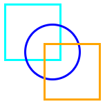


